ai systems · airtribe
airtribe ai skills
two skills at airtribe. one used by the team that writes what paid learners get, one by the learner. in both, what is being designed is how much room the author is allowed.
- role
- product designer
- team
- four: two product designers, one backend, one frontend
- context
- airtribe · pre-reads and cohort live
- year
- 2026
product thesis
a skill is a packaged set of instructions a model works inside. airtribe's two are not versions of each other, and in both the work is the same: deciding what the author may change and what they may never touch.
context
the two pull in opposite directions. inside, the author is a colleague building for a catalogue, so the risk is drift. outside, the author is the model itself, writing for one reader who cannot easily check it, so the risk is trust. the pre-read skill protects the product from its authors; kai protects the reader from the product.
role and ownership
two product designers ran both of these end to end. i took the ground research, the problem framing, the conversations with the lxd team and the stakeholders around them, and the design decisions below; we split the ui screens, and the other designer led the handoff. one backend and one frontend engineer alongside. each skill below is its own case study.
01 · pre-reads · the internal skill
a pre-read is what a learner gets before a live session, and at airtribe they are written by learning designers rather than visual ones. across a growing catalogue that produced fifty lessons which each looked slightly like whoever wrote them.
what drifted, and how
the lxd team took up the problem that pre-reads were walls of text and wanted them interactive enough to be worth opening. the catch is who writes them.
the question
how do you hand ten to fifteen people the freedom to build anything a lesson needs, and still have it come out looking like one product?
key decisions · pre-reads
a skill, not templates or a rulebook
why
templates hold a catalogue together by capping what a lesson can be. a rulebook leaves an author free and gets read once. the lxd team needed both halves at once, across a catalogue still growing.
tradeoff
a skill has to be comprehensive enough to write a whole lesson inside, far more to author and maintain than a page of guidelines.
result
the brand is inherited by construction rather than checked after the fact, so the only thing left for a learning designer to decide is the teaching.
classify by behaviour
why
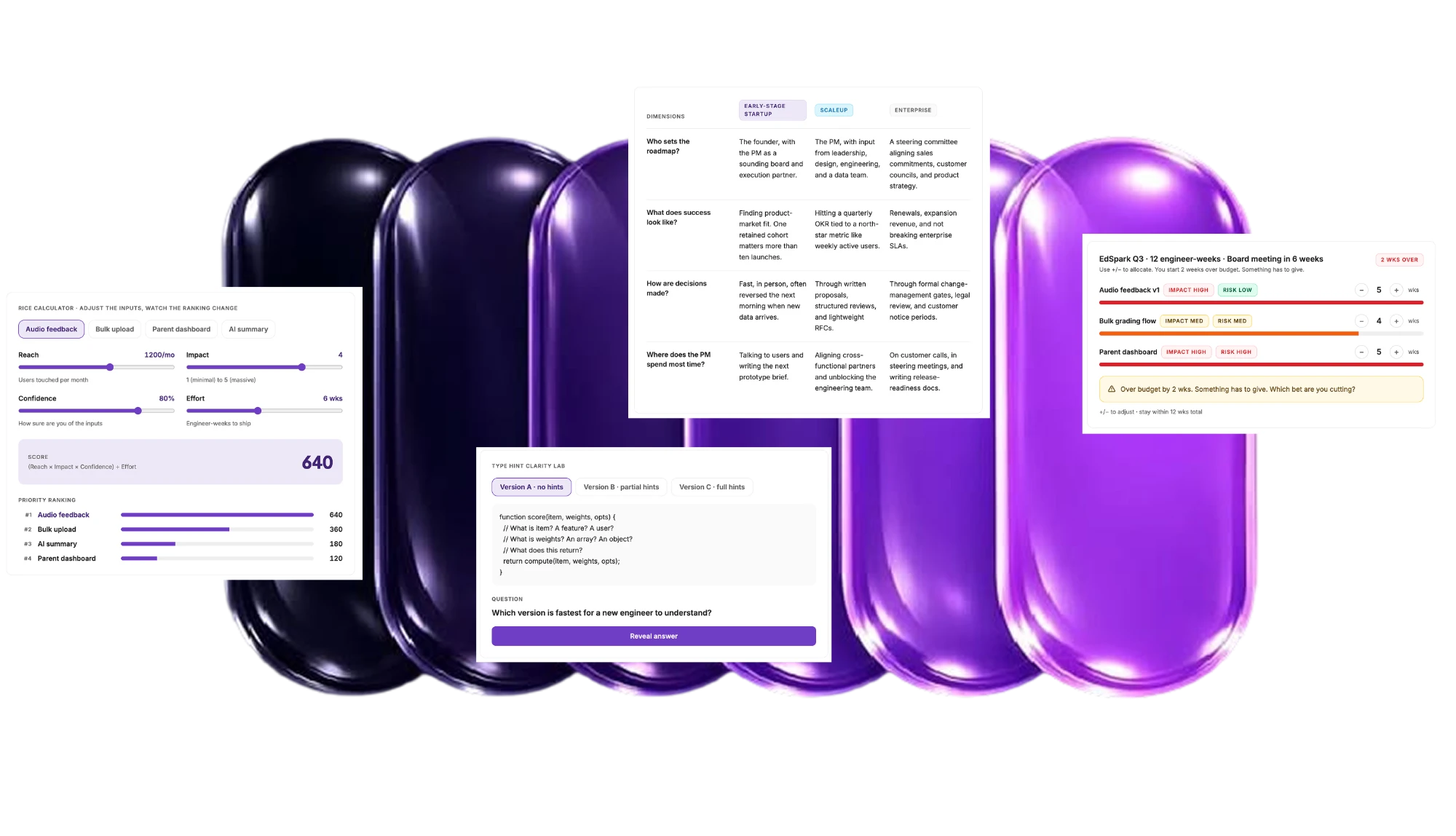
most of a real pre-read is not a library primitive. it is dioramas, chat dialogues, tap-sort exercises, a gamification rail, a 3d rice space. whatever a library failed to cover would have been the interesting part of the lesson.
tradeoff
eight behaviours is coarser than a list of components, and it asks an author to decide what a thing does before building it.
result
anything new is placed by what it does, prose, widget, data-figure, chrome or code, inherits that family's surfaces, and comes out airtribe without passing a designer.
govern the look and nothing else
why
a skill that reached into structure or pedagogy is one the learning designers would route around, and its whole value is that they author inside it.
tradeoff
it can produce a pre-read that is perfectly on-brand and badly taught, and there is no guardrail in it that would catch that.
result
one accent, cool neutrals, two typefaces, every state defined. structure, sections and the teaching stay with the author, and the skill says so in as many words.
the tool we built and threw away
first direction
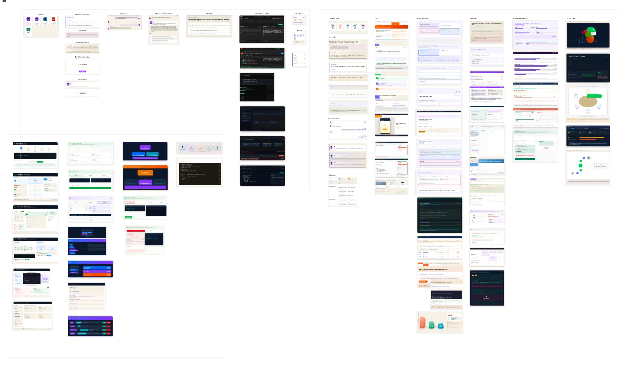
the lxd team arrived with a version that had every possible interaction in it. we broke it into categories, shipped a basic version, and it was rejected: too simple. so we went back and did the pedagogical work we had skipped, then built a component maker, a framer-like tool for assembling the artifacts.
what happened
it made the workflow worse. the chain already ran designer, program manager, copy-paste into the dashboard; the maker added another station and one more place for an error to enter.
what changed
we scratched it and built the skill instead, comprehensive enough that the designer writes the whole lesson inside it and hands over a link. the rule: when a tool sits between the person who understands the material and the thing the learner reads, the tool is the problem.
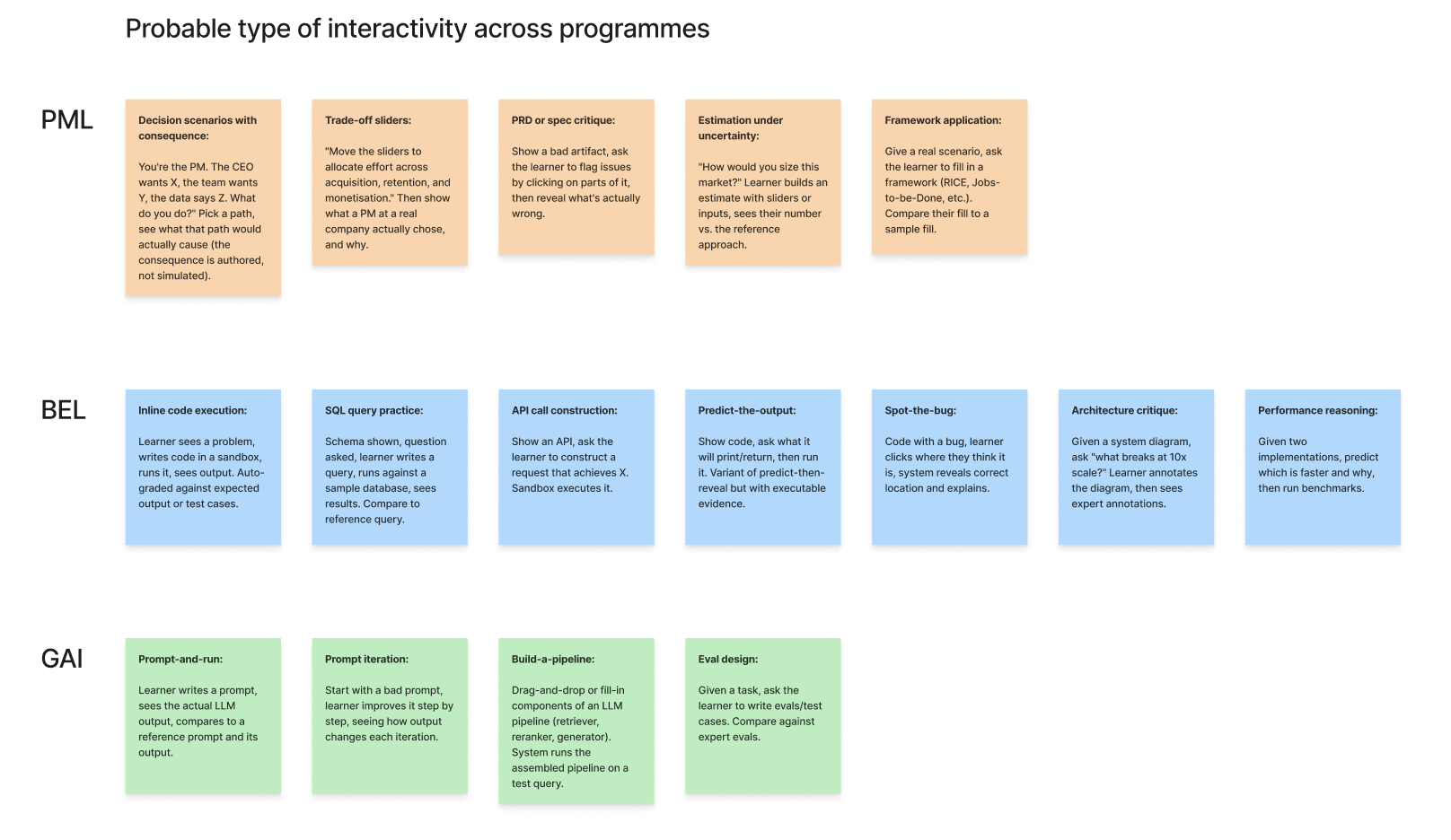
what interactive was actually doing
- 01
two jobs, and only one of them teaches
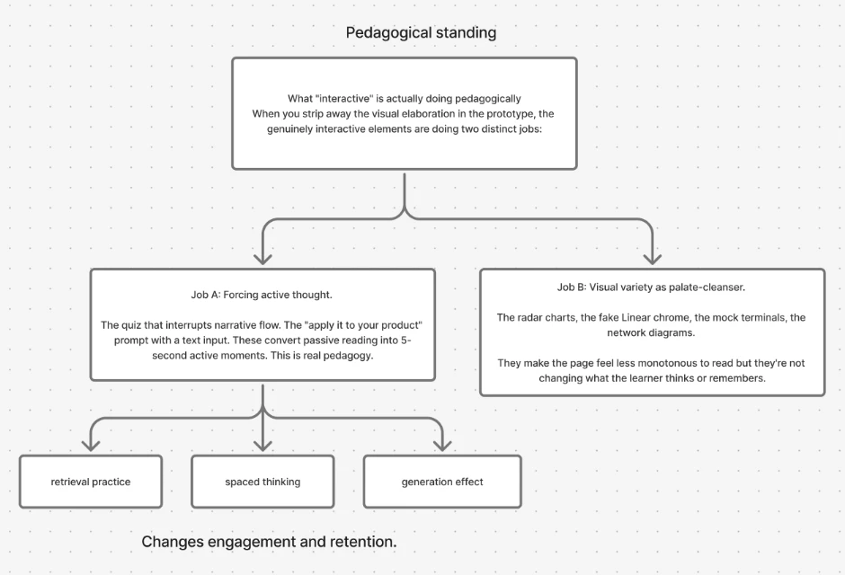
every interactive element in the prototype, sorted into two piles. job a forces active thought: the quiz that interrupts the narrative, the prompt that makes you apply it. job b is visual variety: radar charts, fake chrome, mock terminals.
- 02
job b is allowed, it is just not progress
visual variety makes a page less monotonous. it does not change what the learner remembers. the prototype was dense with job b, and we had read that density as evidence the lesson was interactive.
- 03
name the mechanism, or you are only adding widgets
job a works because of retrieval practice, spaced thinking and the generation effect. writing those down let us argue for one interaction over another instead of about how many there were.
the workflow the skill actually changed
the designer writes the lesson
the learning experience designer designs the material and its teaching in one pass, inside the skill.
before, they designed the material and handed it on to someone else to assemble
a link, not a document
what comes out is an interactive lesson at a url.
before, a program manager copy-pasted the material into the internal dashboard, which is where errors entered
the manager embeds the link
the program manager drops it into the learner dashboard. that is the whole handover.
content quality now belongs to the person with the pedagogy, and uniformity belongs to the skill
scroll the run →
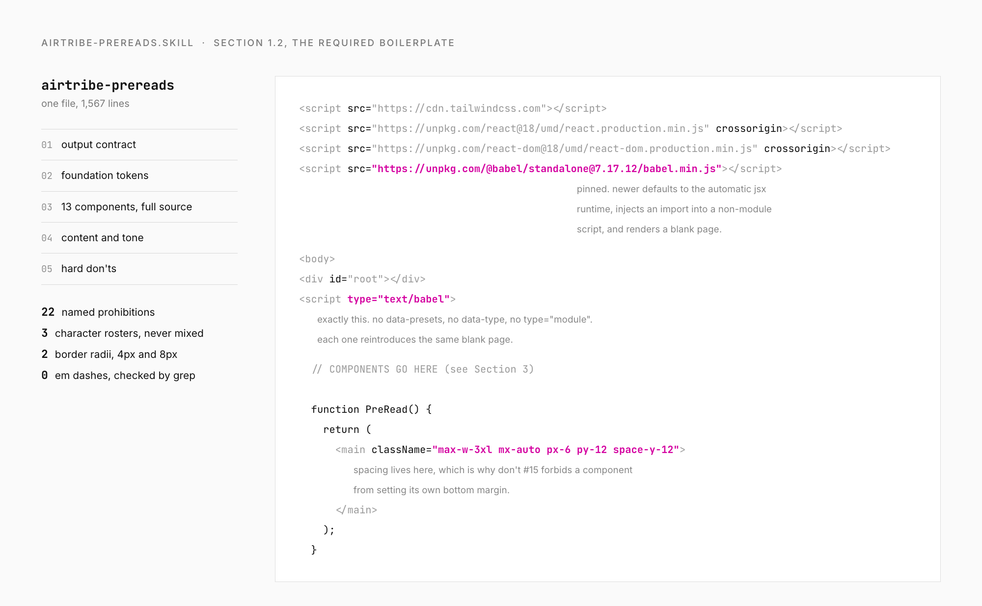
what the spec carries besides colour
a file, not a design file
one self-contained html page, react and tailwind from a cdn, no build step, so a learning designer can upload it without an engineer.
a pinned version, with the reason next to it
babel standalone is pinned to 7.17.12. newer builds default to the automatic jsx runtime, which injects an import into a non-module script and renders a blank page. the pin is written down with the failure beside it.
one exact script tag
type text/babel, with no data-presets, no data-type and no type module. each reintroduces the same blank page.
a weight budget
the renderer accepts 500kb. generated pre-reads land between 50 and 80kb, so the budget is headroom rather than something an author thinks about.
an allowlist, not a hope
the content security policy names the script, font and avatar hosts by hand. without it a file works on the designer's laptop and nowhere else, and the failure arrives weeks later as somebody else's bug.
no em dashes, anywhere
a copy rule that is really a visual one, checked with a grep before shipping. the smallest rule in the system and the most reliable tell for whether a lesson went through it.
the spec that was too tight
first direction
the first version was prescriptive: thirteen components with their full source in the file, two permitted border radii, twenty-two named prohibitions, and a rule saying do not invent new components. on its own terms it worked.
what happened
the lxd team found it too limiting. they built their own pre-reads outside it, with components the thirteen did not cover, and those were the ones that shipped, off the visual language. the worst available outcome: a spec nobody authored inside, and a catalogue that had stopped looking like one product.
what changed
it was rewritten to govern less. thirteen components became eight behaviour families, radius went back to the author, and the scope narrowed to the visual layer alone. a rule people route around protects nothing.
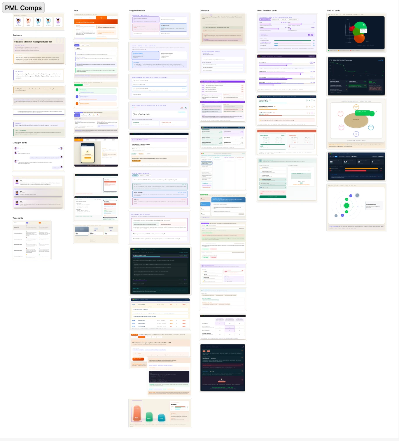
eight families, not a component library
the catalogue is not a set of components, it is eight behaviours with a visual treatment attached. each family carries the same three constants: purple is the one accent, neutrals are cool, colour means state.
- 01 reading & narrative
- → prose on the ground, accent for emphasis, never a boxed paragraph
- 02 characters & dialogue
- → learner bubble purple-tinted, mentor neutral, always inside a panel
- 03 assessment & interaction
- → selected purple, correct green, wrong red, no confetti
- 04 calculators & inputs
- → purple is the value, semantics are the state, tabular numerals
- 05 comparison & structured
- → column tags, hairline separators, a middle dot for an empty cell
- 06 data-viz & dioramas
- → chart palette purple-led, real type inside the svg, dark surfaces never black
- 07 app chrome & gamification
- → purple progress on cool neutrals, calm rather than arcade
- 08 technical, code & diagrams
- → a defined code surface, mono for code, palette-restrained connectors
permissive on purpose. radius is the author's choice as long as one pre-read is consistent with itself.
colour
- 683FBEpurple, the one accent
- 2563EBblue, info
- 12875Agreen, correct
- DC2626red, wrong
- CA8A04yellow, warning
type
- displayplus jakarta sans
- bodyinter
- datajetbrains mono, real code only
what a guardrail looks like up close
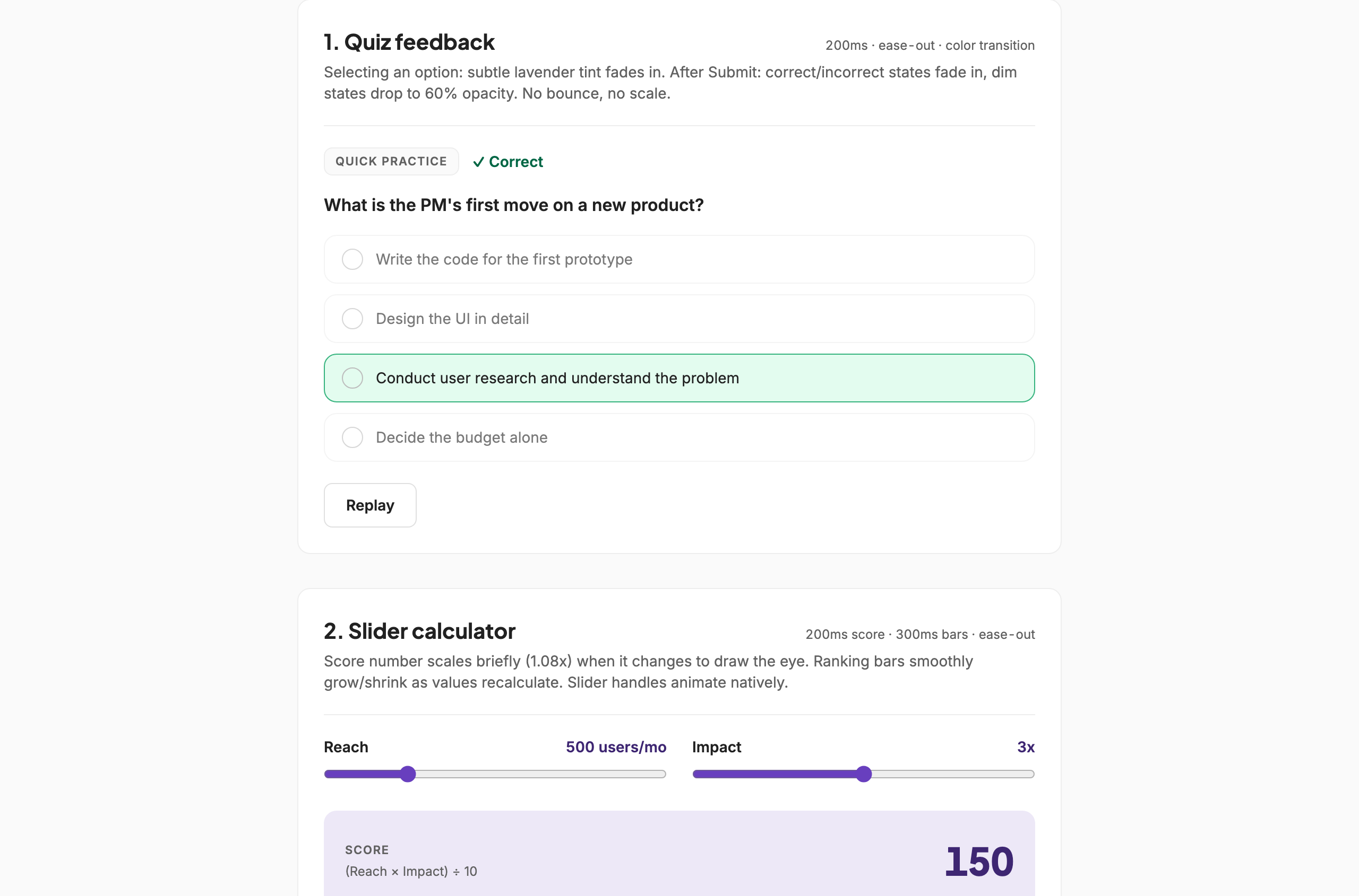
- 01
one accent, one job
the score, the slider fill and the chosen row are the same purple. correctness is green, over-budget is red, because colour is only ever allowed to mean state.
- 02
every state, or it isn't done
hover, focus-visible, selected, correct, incorrect, disabled. a component with only a default state is unfinished.
- 03
the spec sits in the corner
200ms, ease-out, colour transition, written beside the component so the next author does not guess at what calm looks like.
- 04
replay, not confetti
the reward for a right answer is the state change, plus a way to run it again.
- 05
a written list of what we are not doing
kind a hangs off an interaction, eases out, finishes inside 500ms. kind b was decorative, scroll fades on prose, confetti, ambient loops, bounce and elastic easings, and it did not ship. it sits in the spec under what we are not doing.
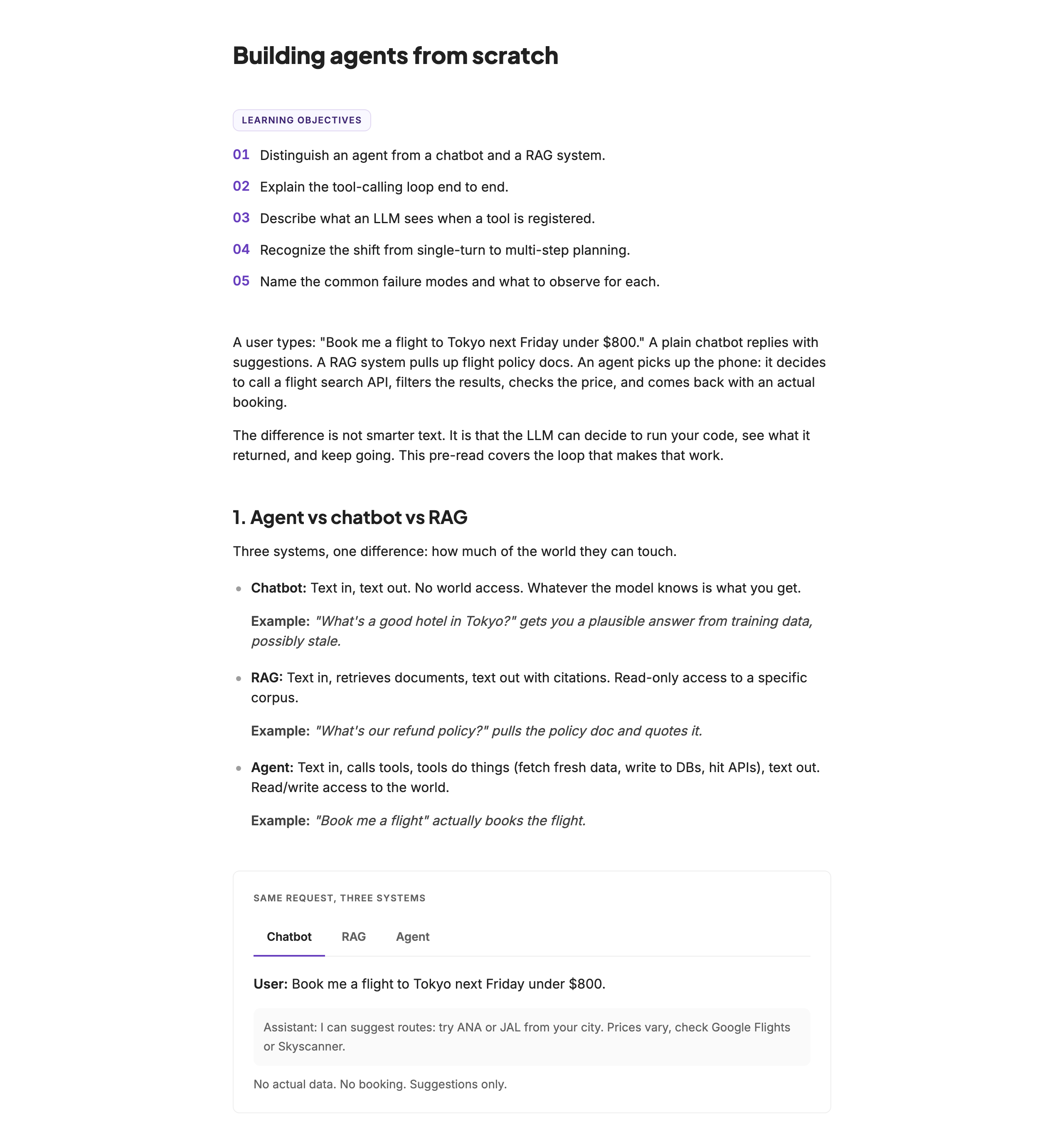
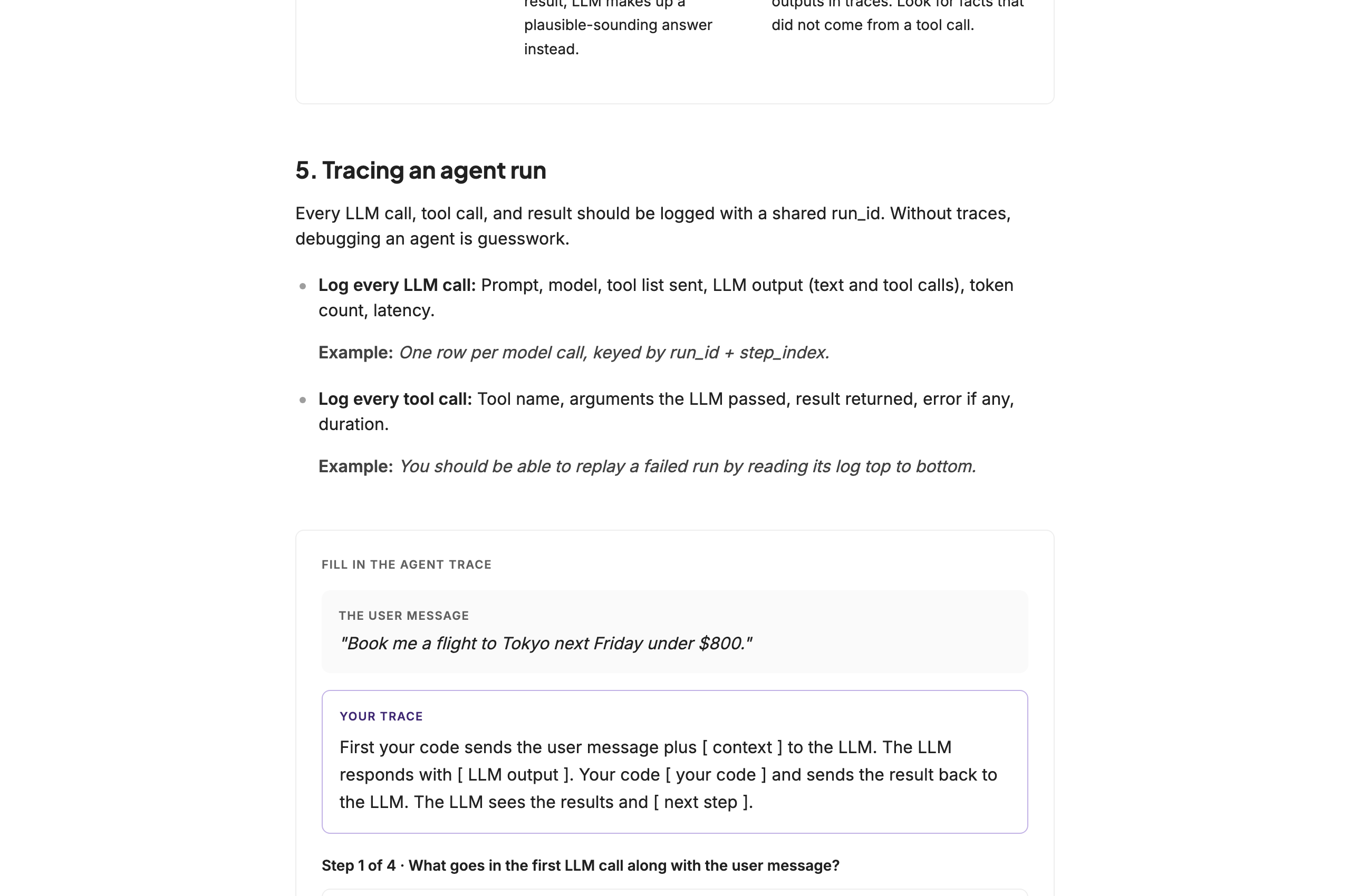
outcome · pre-reads
the skill carries around fifty pre-reads across fifty modules, five subtracks and three courses, reaching more than fifteen hundred learners, authored by ten to fifteen people with no visual designer in the loop. those are scope figures, not outcome claims.
of the four hundred and twenty learners who answered the closing prompt in phase one, sixty per cent called the format more positive and engaging. that is one phase across two tracks, not the catalogue, and it is the one measured signal this work has so far.
what the system did to the work is still the next thing to measure against a baseline: adoption over one-off styling, review rounds per pre-read before and after, brand-audit pass rate, and whether authors say they can ship on-brand without design support.
02 · kai · the consumer skill
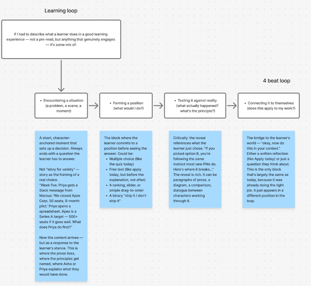
most 'learn anything with ai' products are a chat box with a better frame: you ask, it answers, and what you are left with is a transcript. kai writes a lesson instead, to four answers you give before it starts.
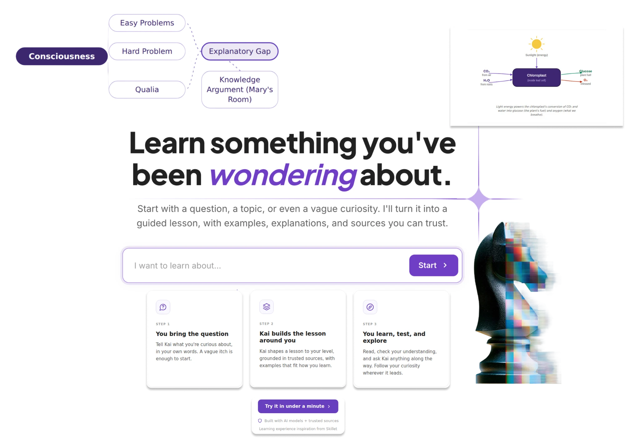
what kai is
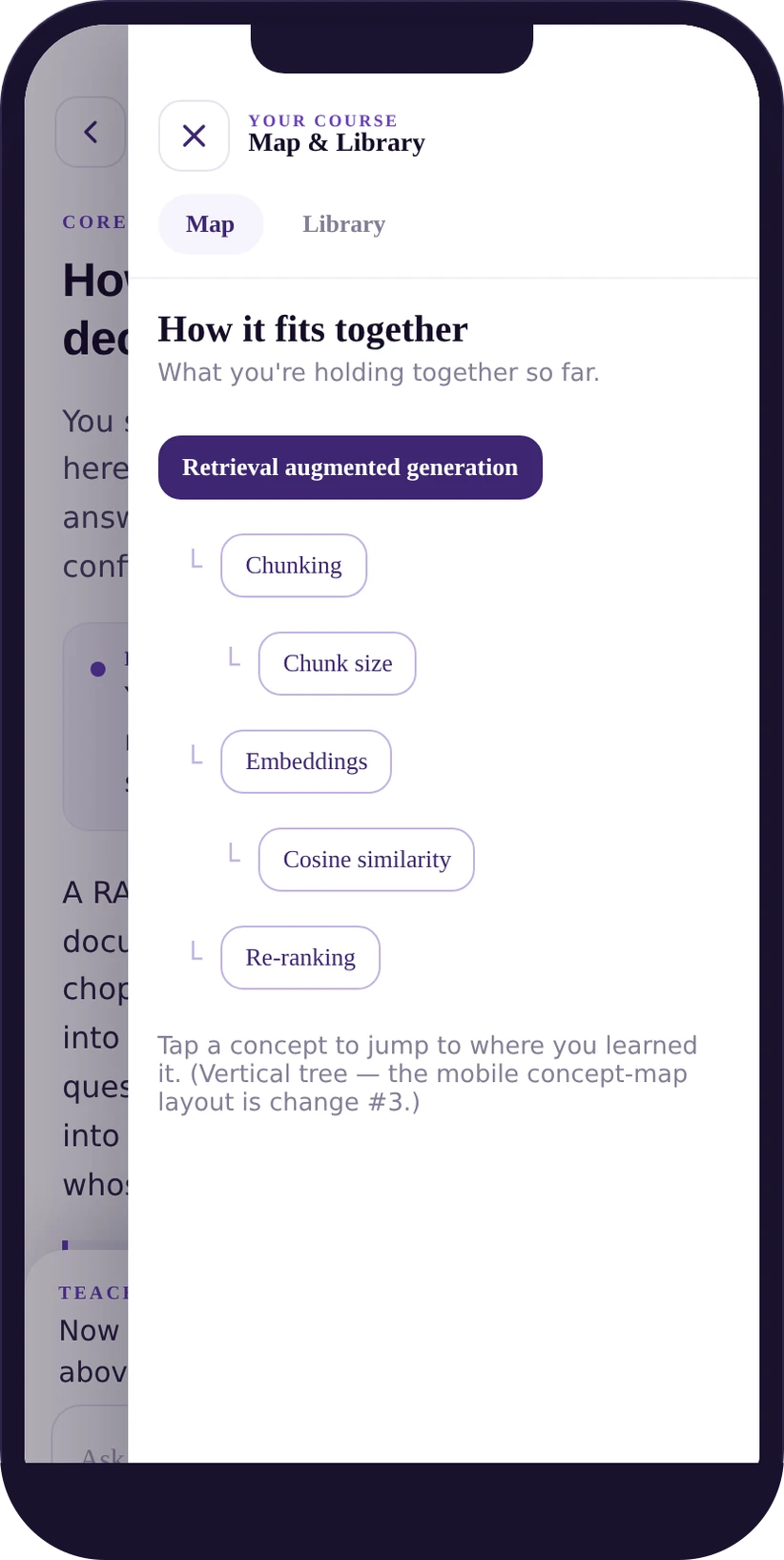
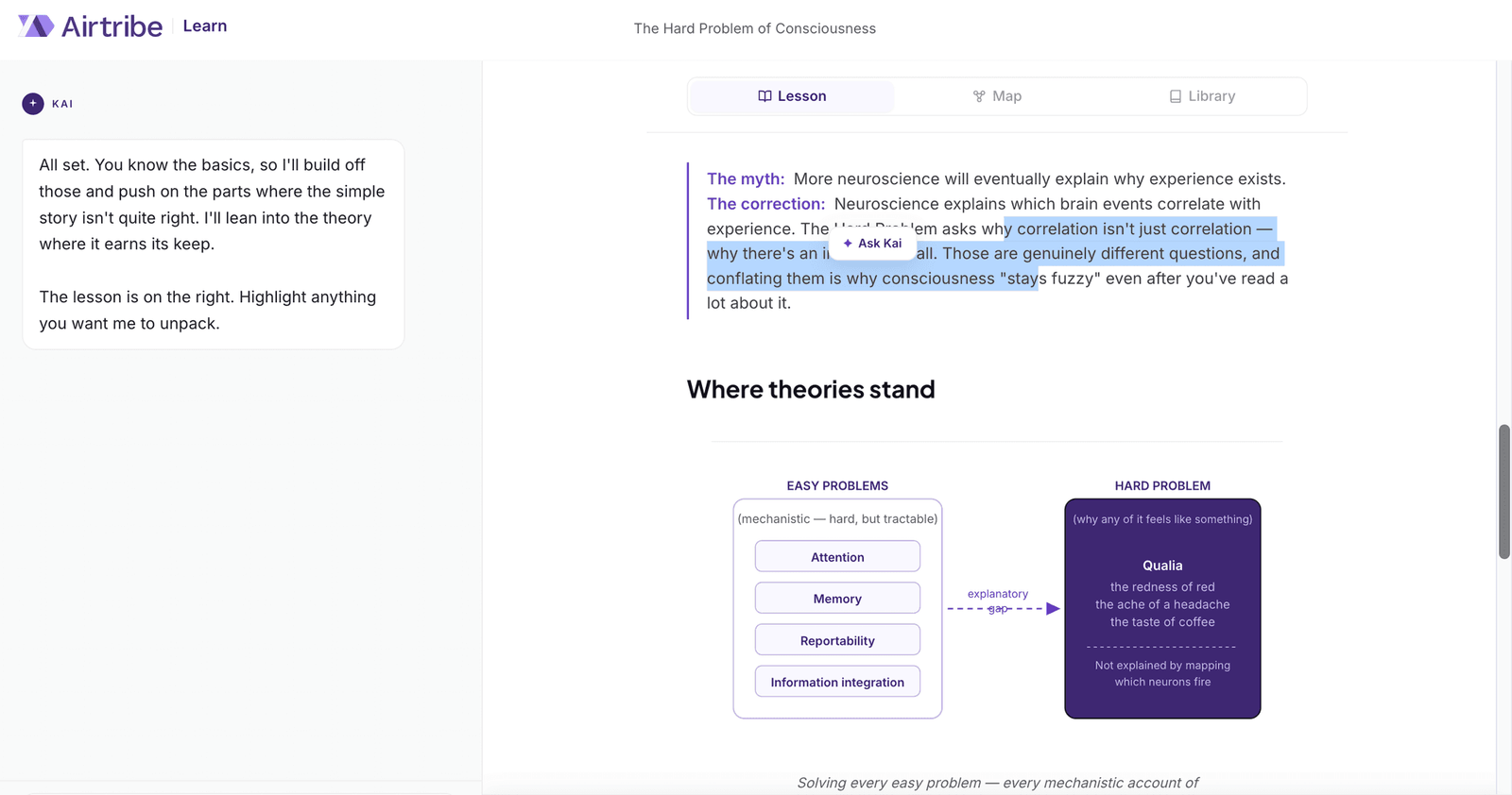
kai is an ai-first learning experience for the airtribe community: give it a topic, answer four questions, and it writes the lesson to those answers. a concept map draws the ideas as you read, a library holds the source behind every claim, and kai unpacks any phrase you highlight.
the question
what if ai adapted to how someone learns, instead of only answering what they asked?
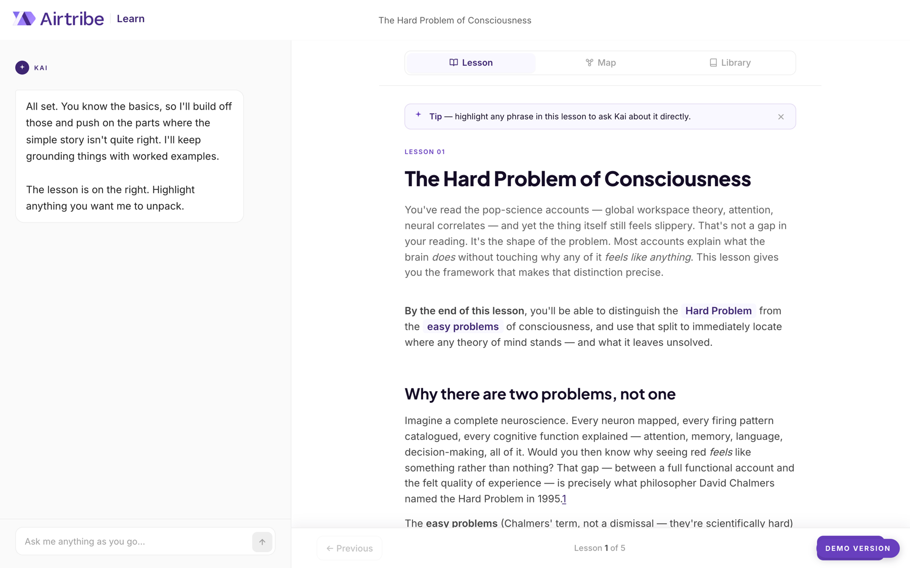
kai opens a lesson by naming what you already know. it is one sentence, and it does more for trust than anything else in the product.
how a lesson gets made
topic
you give kai something you have been wondering about.
intake
four questions: purpose, background, prior knowledge, depth.
asked once, up front. personalising afterwards writes the lesson for no one
lesson
a hook, a worked example, the misconception, a quick check, a reflection.
map
the concepts and their links, drawn as you read.
library
the source behind each claim, marked cited and linked out.
scroll the run →
key decisions · kai
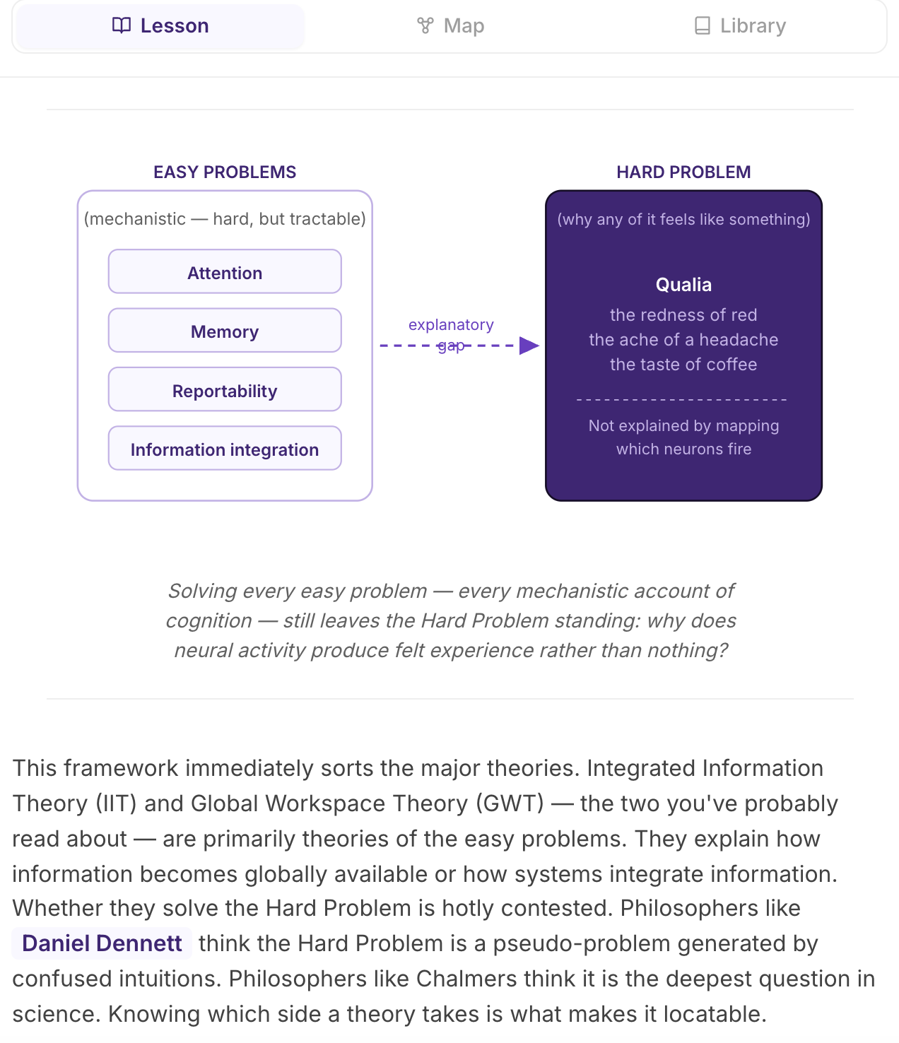
build it the way a teacher would
why
a chat answers the question you asked and skips the shape around it. that is nearly the opposite of teaching.
tradeoff
the output has to be planned before it is written, which is far more machinery than answering.
result
a hook, a worked example, the misconception that keeps the idea fuzzy, a quick check, a reflection. the hard idea gets a diagram, not another paragraph.
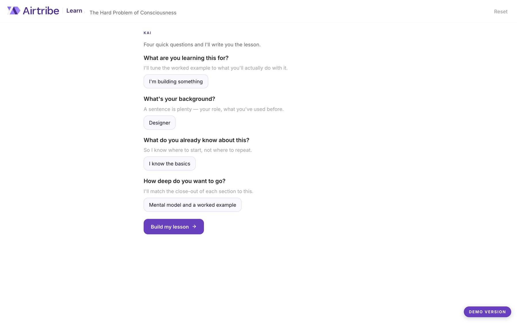
ask four questions, then commit
why
personalising after the fact, a simplify-this button, comes too late; the lesson is already written for no one.
tradeoff
four questions is four screens before anyone has read a single word.
result
purpose, background, prior knowledge and depth are set once, and the lesson, its examples and how far each section pushes are written to them.
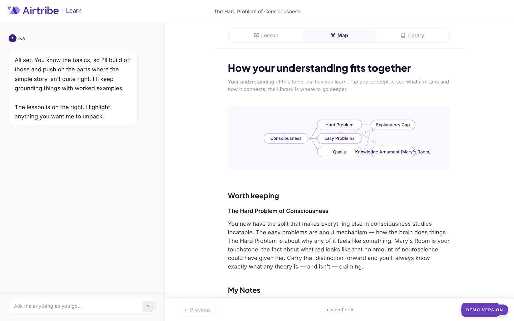
draw the topic while you read it
why
a lesson you read and close leaves nothing you can hold onto.
tradeoff
a second, structural view of the topic to build and keep in step with the lesson.
result
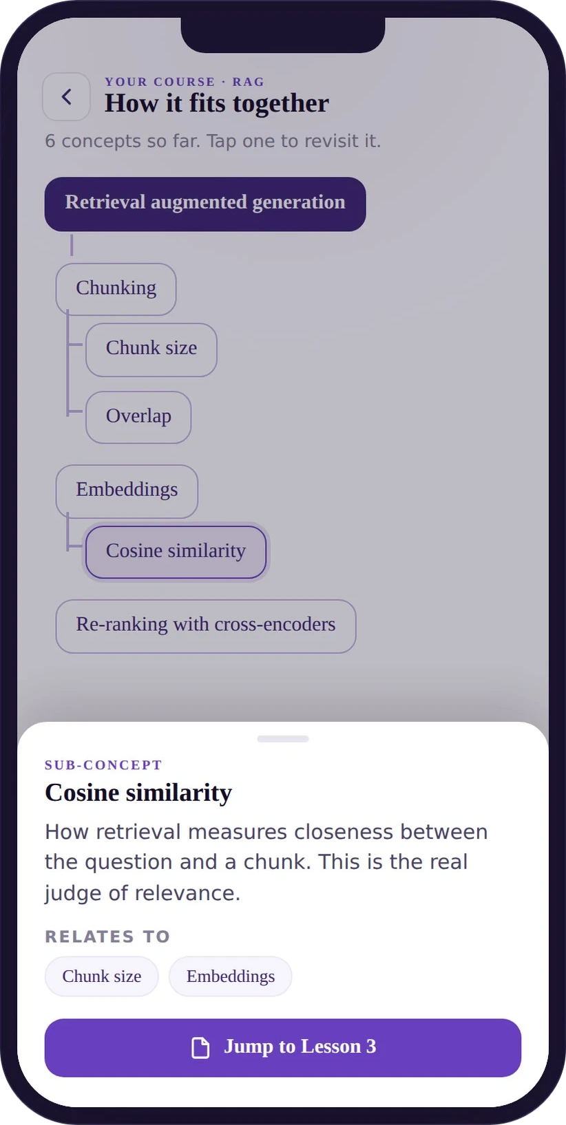
the map draws the concepts and their links as you go, with room for your own notes, so the shape of the topic outlives the reading.
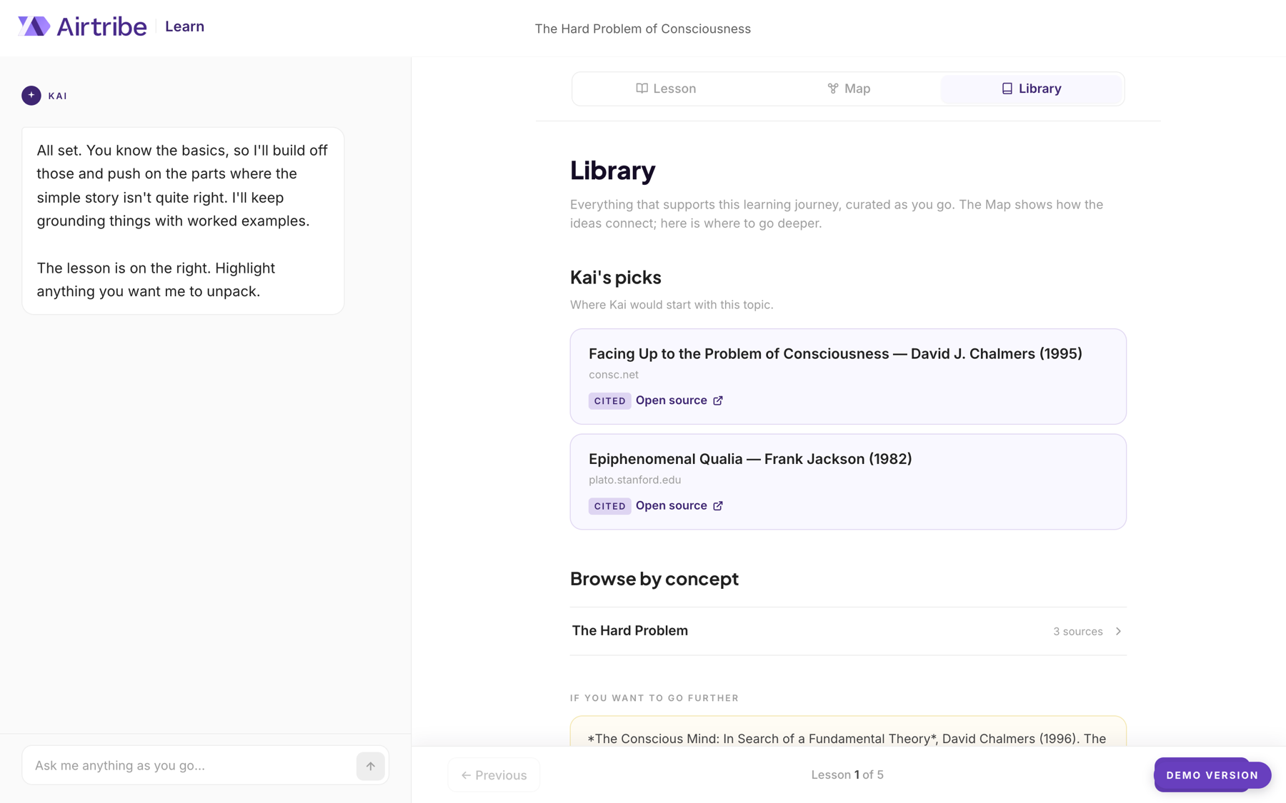
cite sources, not vibes
why
an ai that merely sounds confident is easy to build and easy to distrust.
tradeoff
every claim has to trace to something real, in the lesson and in the library.
result
key sentences are footnoted, and the library gathers the sources, each marked cited and linked out.
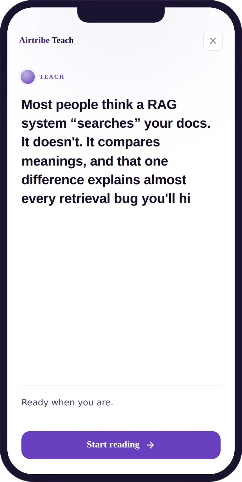
the wait we tried to hide
first direction
generating a lesson takes ten to thirty seconds, and the first instinct was the usual furniture for that gap: a spinner, or a progress bar.
what happened
a progress bar that tracks nothing is a lie, and neither it nor a spinner gives the learner anything to do. the countdown we tried next was worse than both: naming the seconds left makes the wait feel longer.
what changed
the building screen became a wait ladder: a hook lands immediately, then the shape of the lesson assembles line by line while the rest is written, so the learner is reading before the lesson exists. a notify me hatch sits under it. the rule: dead time is a content problem before it is a loading problem.
the map that could not be shrunk
first direction
on desktop the concept map is an svg, with measured and word-wrapped text and collision-free tree packing. the obvious move for the phone was to scale that same svg down.
what happened
shrunk, it is unreadable and un-tappable. the svg had already cost a layout bug, labels like 'knowledge argument (mary's room)' overflowing their nodes. the phone version was not a rendering problem, it was the wrong object.
what changed
the phone got a different map rather than a smaller one: a native vertical tree of plain dom lists with css connector spines. it scrolls, it wraps, a tap opens a focus card. two renderings for two jobs beats one compromised for both.
the rest of what the phone changed
kai is a sheet, not a screen
kai was close to becoming a separate destination, which fights the product: the lesson is the point. it became a peek and expand sheet, a line at the bottom that one tap brings up over the lesson, so the lesson never leaves.
the header was carrying desktop clutter
teach appeared twice on the expanded sheet, and the demo badge sat on the header's map icon. the fix was not to nudge either: the header came down to brand left and map icon right, the breadcrumb went, the badge moved to the bottom. a collision is usually a density problem in a positioning costume.
the em dash rule did the editing
the hook was written with em dashes, which the project style forbids. rewriting them as full sentence breaks made it punchier. the pre-reads spec above carries the same rule.
a way out of the model
an ai-first product that never points outside itself is asking to be trusted more than it has earned.
outcome · kai
kai runs inside airtribe and has reached more than ten thousand learners. it sits behind the login, where it is available to enrolled learners and nobody else.
so what is linked here is a demo build: one seeded lesson running the full system end to end, with the intake open to any topic. it exists so that this page has something you can actually open. what it carries is the shape, an ai learning product can plan a lesson rather than answer a question, and the cost is four screens of intake before anyone reads a word.
both are defined by what they refuse. the pre-read skill refuses confetti. kai refuses to just answer. in a system that generates, the design decision worth having is almost always a subtraction.
want the full story?
the pre-reads the internal skill produces are what paid learners get, so the system and the reasoning are public here and the lessons themselves are not.
the spec, the audit the eight families came out of, and the version that was built and thrown away are all things i am happy to walk through privately.
reflection
i was annoyed when the first version came back as too simple, and it took me a while to hear what was being asked: not more components, but evidence we had thought about the teaching. the skill still governs only how a pre-read looks, so it can produce something on-brand and badly taught.