service design + ux · kochi metro
kochi1app
a service-design redesign of kochi's official transit app: plan a trip by intention, make the greener route the easy one, and design the transfers and the last mile the map leaves out.
- role
- service design + ux
- context
- kochi metro · mobility app redesign
- year
- 2024
product thesis
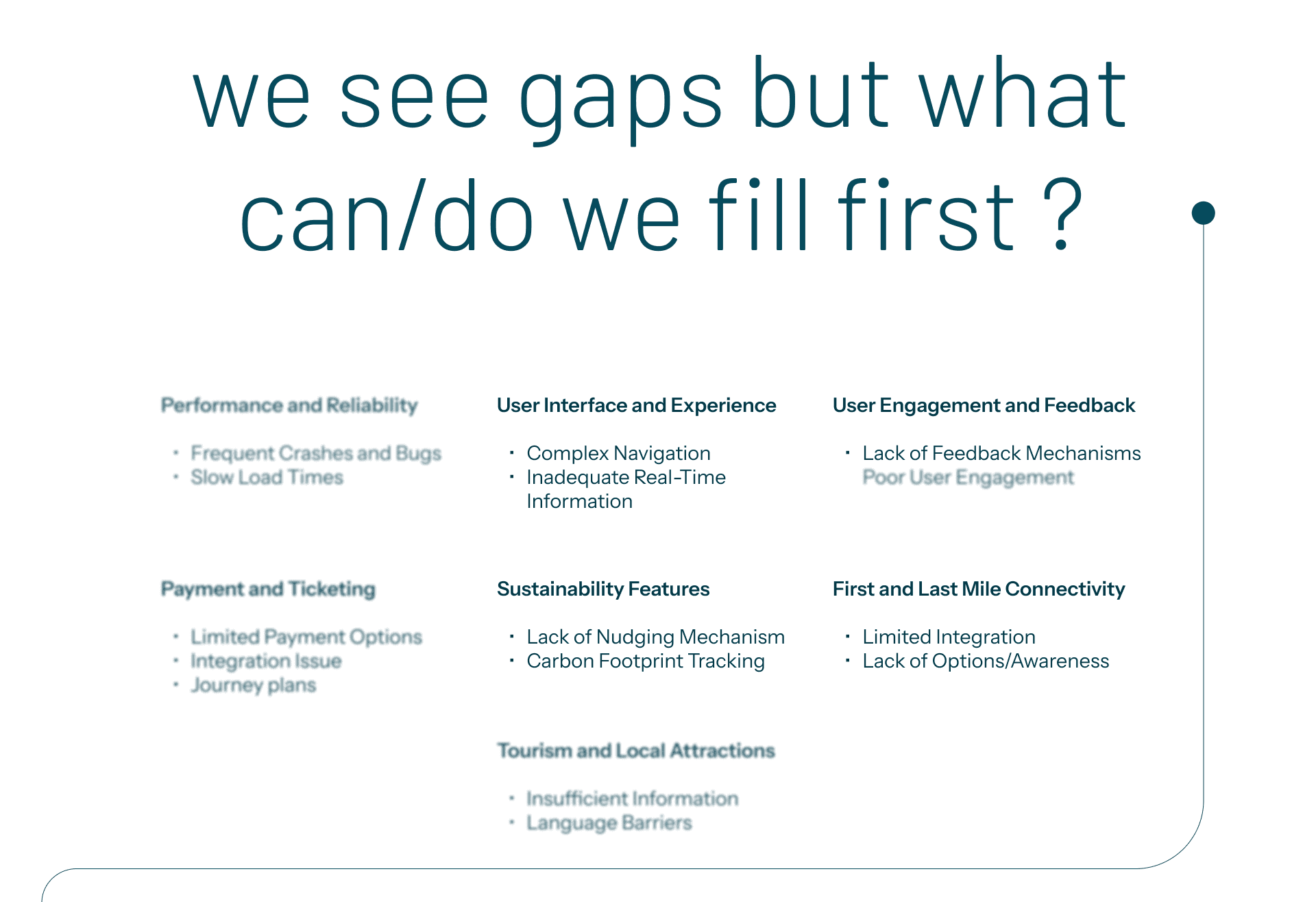
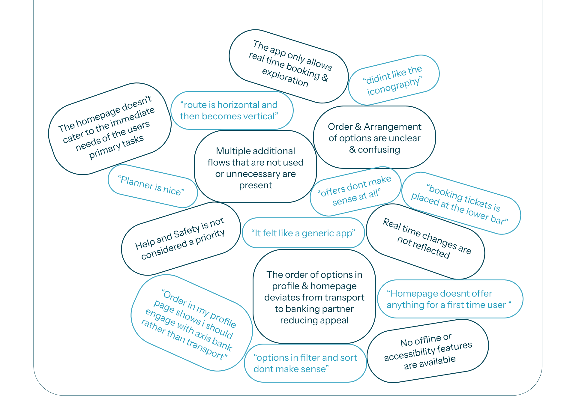
people could already find a route in kochi1app. what they could not find was what the trip would actually be like, whether the transfer was walkable, where the exit came out, how long they would be standing in the sun waiting for the connection. the redesign is mostly about that gap.
role and ownership
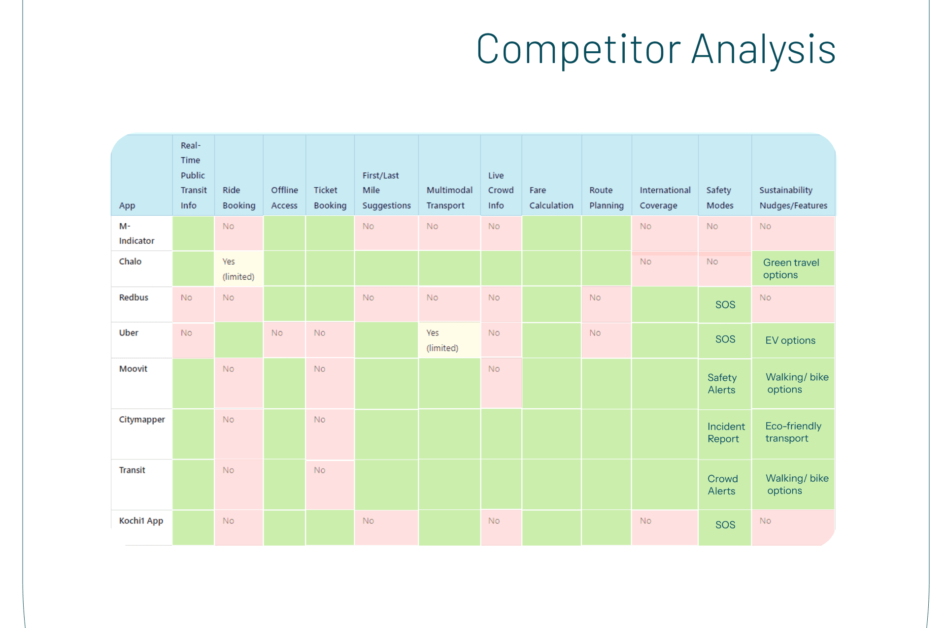
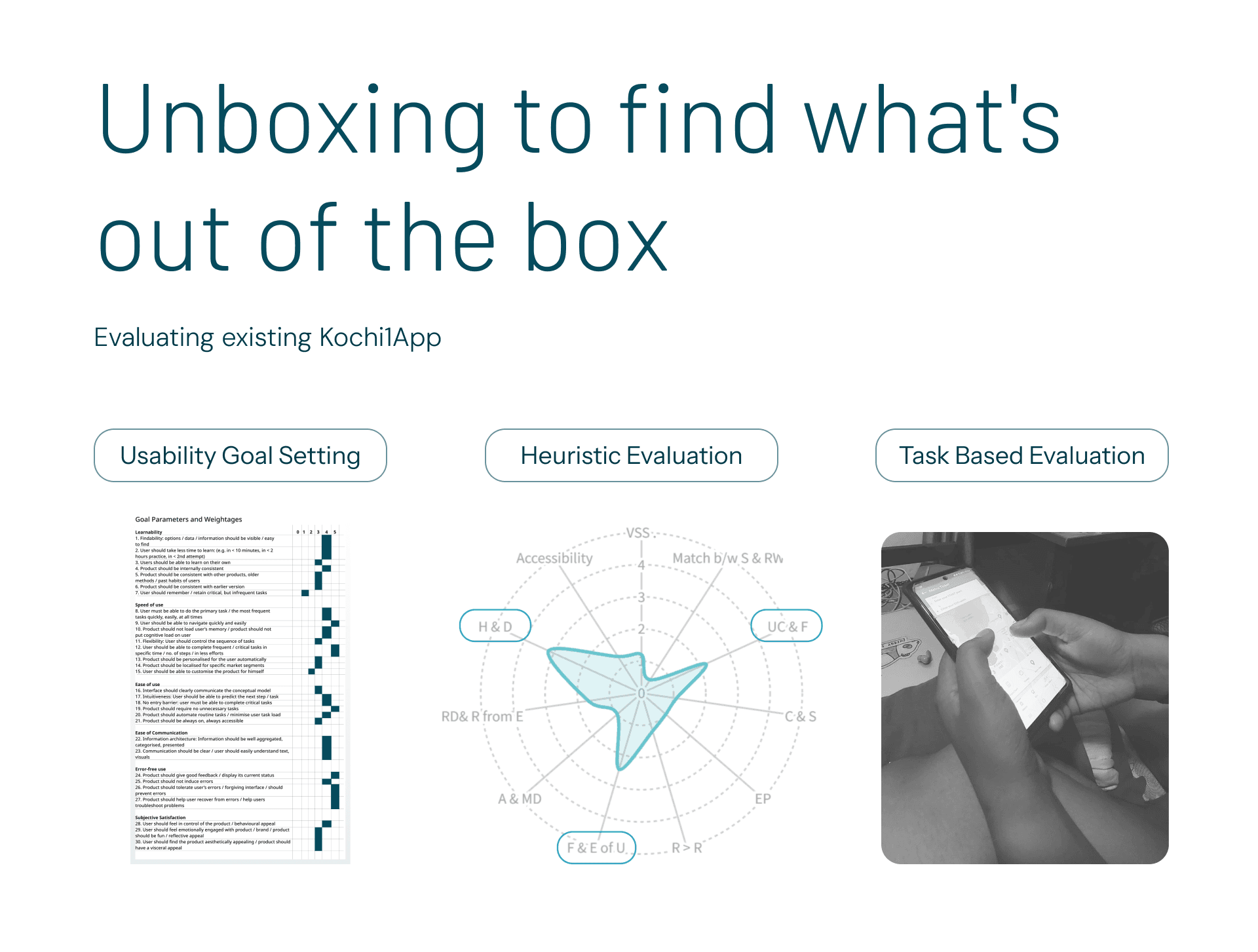
kochi1app is the official app for kochi's metro and water metro. i ran an end-to-end service-design study across the city's multimodal transport, interviews with riders, station staff and management, personas, journey maps, service blueprints and a competitor teardown, to find where the app leaves people stranded rather than just where a screen looks dated.
everything on this page is mine: the research, the framing, the information architecture, the screens and the usability testing.
the research
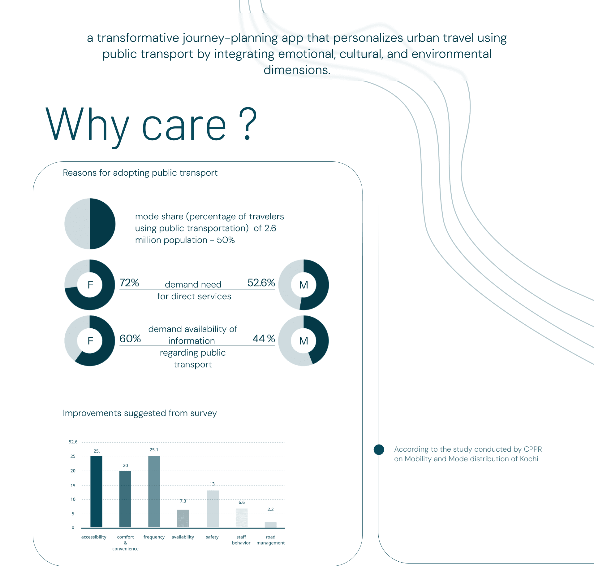
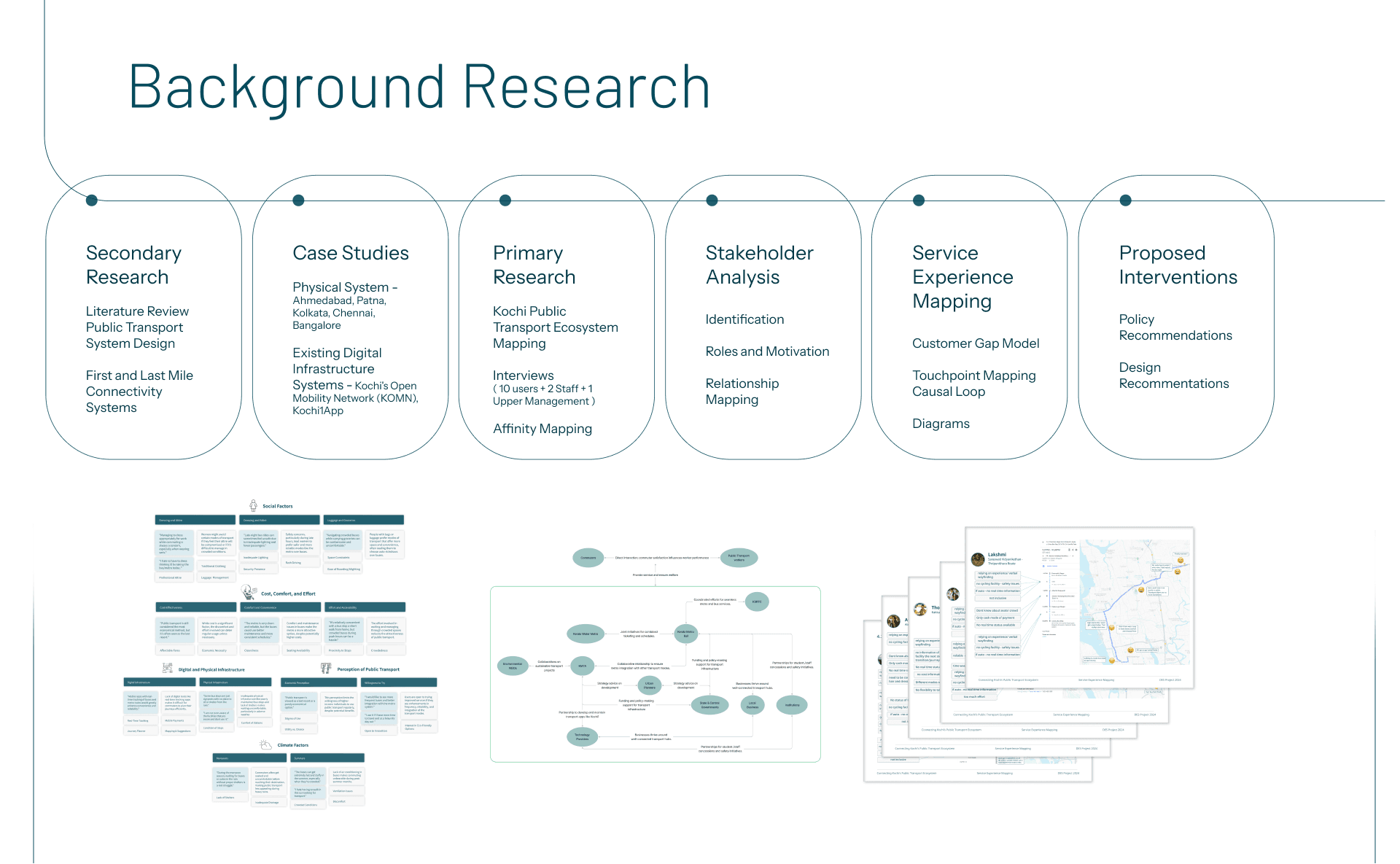
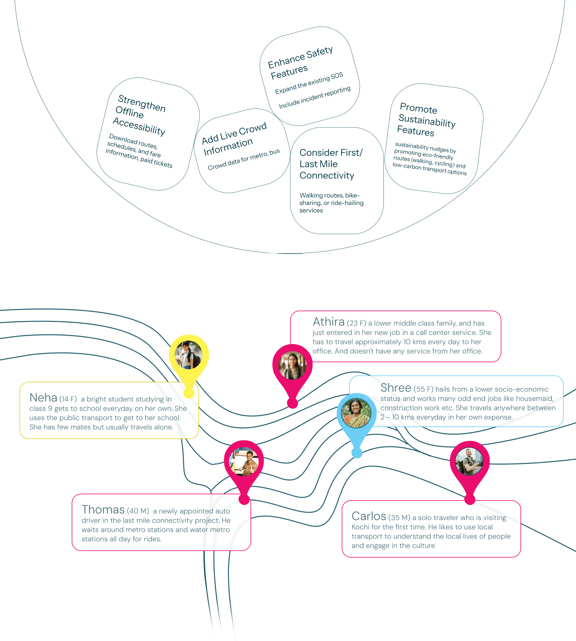
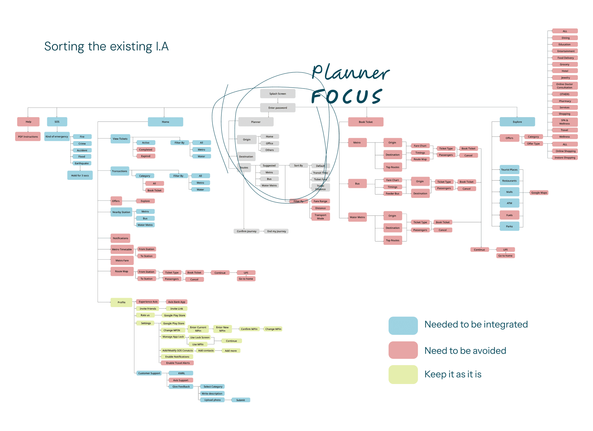
secondary research and case studies from ahmedabad, kolkata, chennai and bangalore, then primary work in kochi: ecosystem mapping, interviews across riders, station staff and management, stakeholder and affinity mapping, and service experience mapping through a customer gap model, touchpoint maps and causal loops.
key design decisions
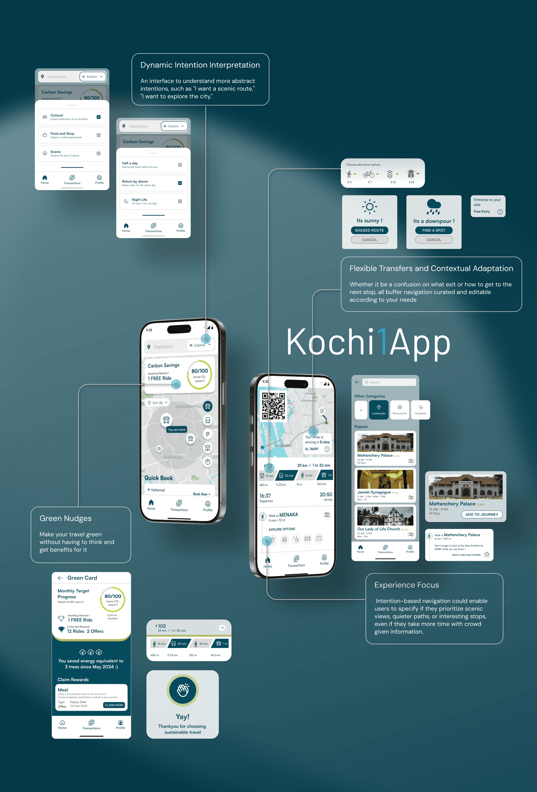
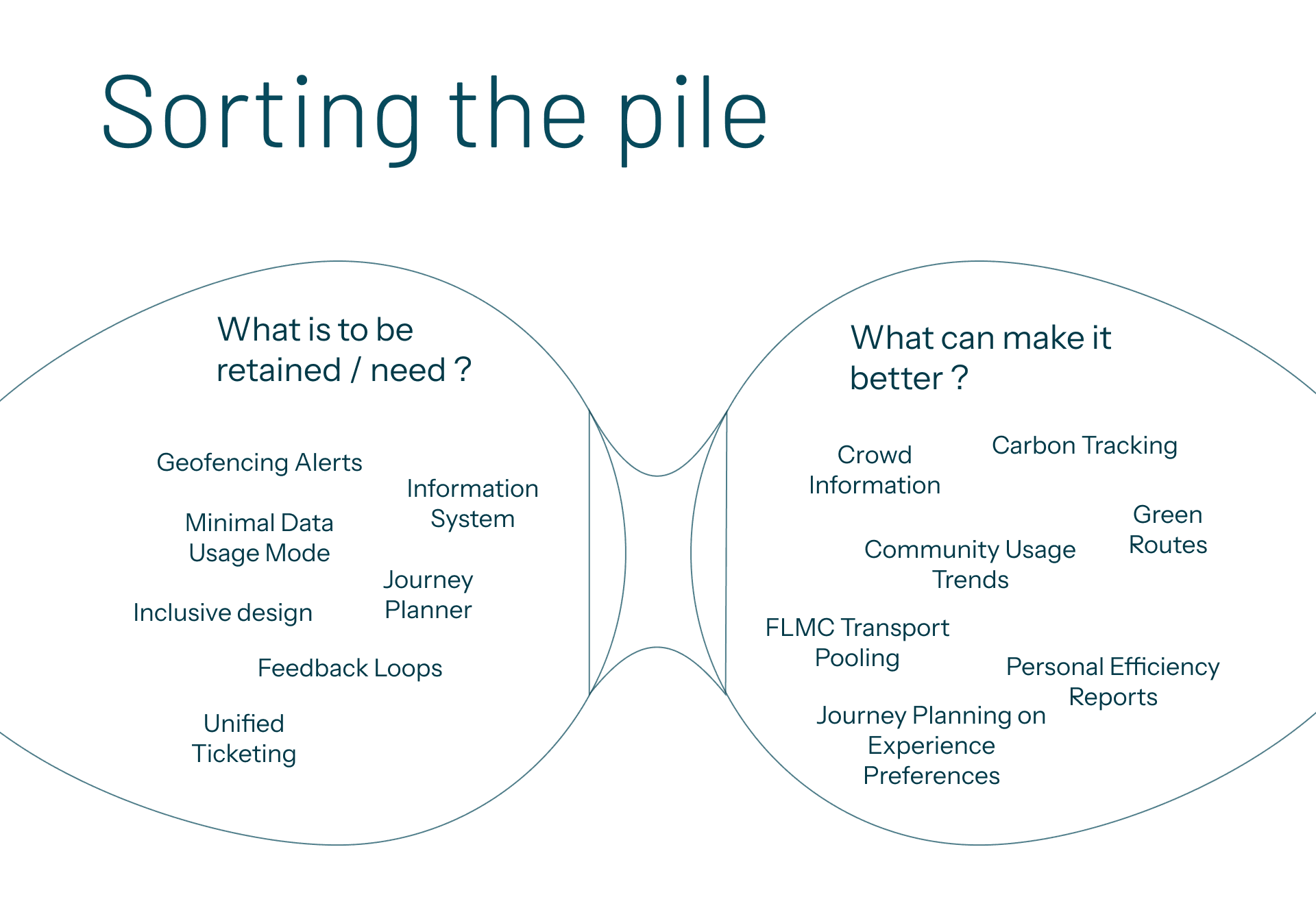
plan by intention
why
people don't only travel to an address. they travel to explore, to catch a scenic route, to be home before dark. the old app only understood destinations.
tradeoff
the planner has to turn a fuzzy intent, i want to explore the city, into concrete routes.
result
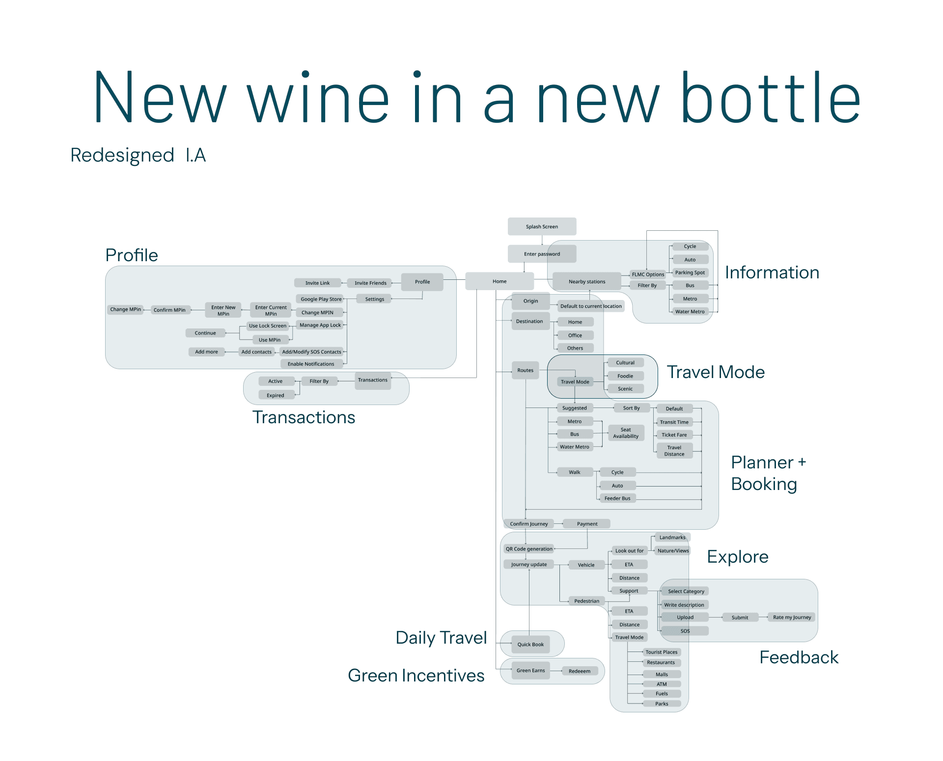
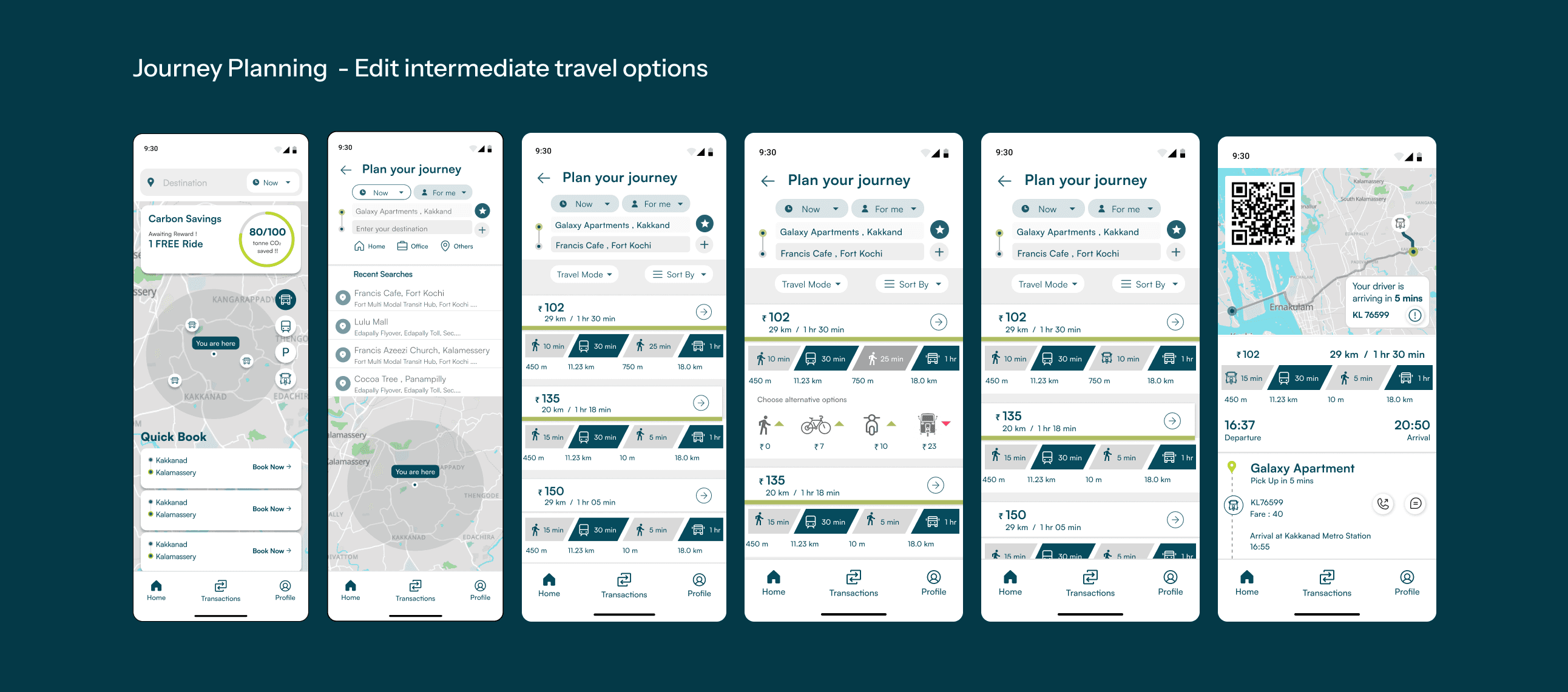
a dynamic intention layer: choose cultural, scenic, food, half a day or home by dinner, and the trip is built around that, not only the fastest line.
make the greener choice the easy one
why
a sustainability nudge only works if it costs the rider nothing to think about.
tradeoff
reward mechanics turn gimmicky fast if they are not tied to something real.
result
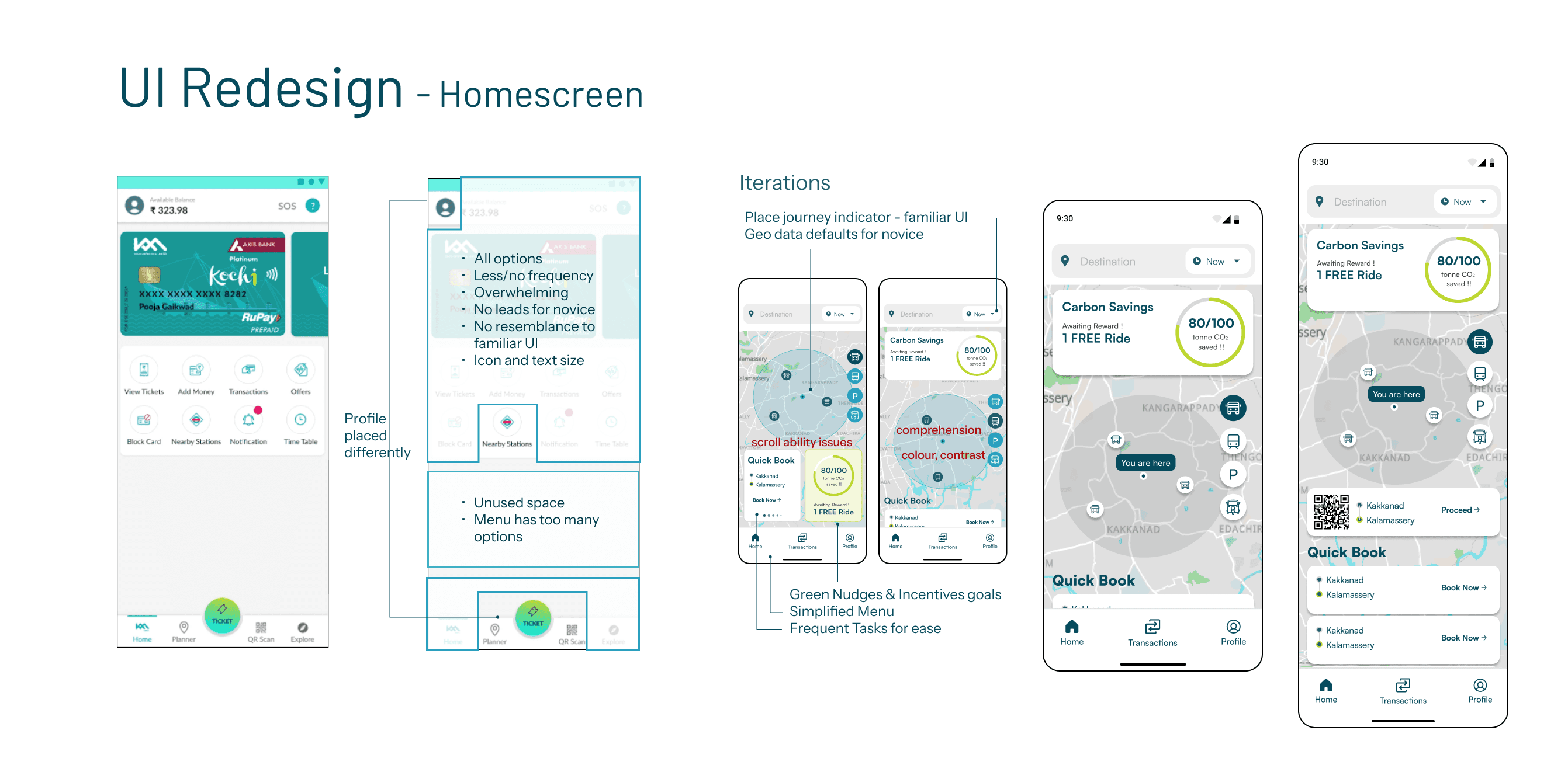
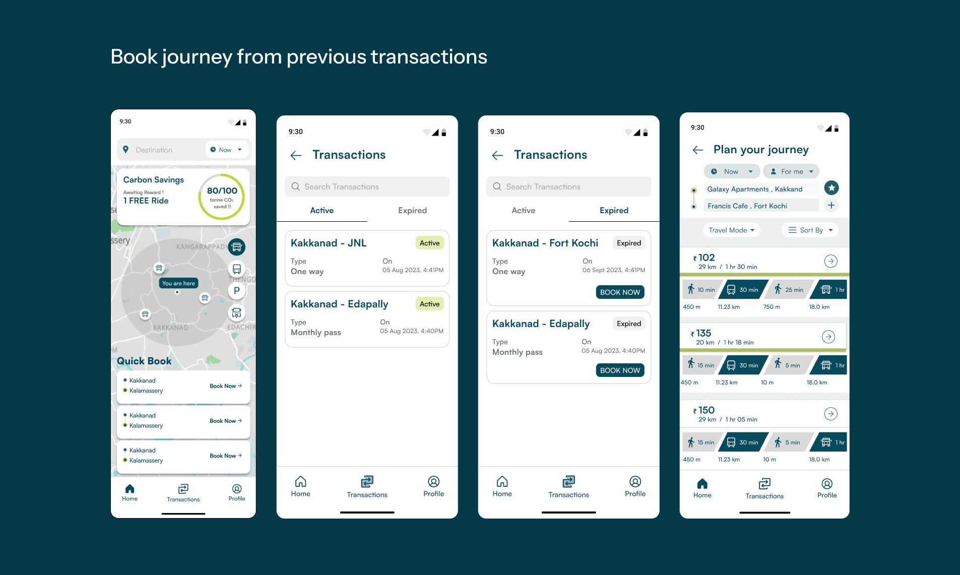
a green card tracks carbon saved against a monthly target and pays out small, real rewards, a free ride or an offer, for low-carbon routes.
design the transfer and the last mile
why
the trip breaks where the app stops: the confusing exit, the missed connection, the walk nobody mapped.
tradeoff
far more surface than a point-to-point route: buffers, alternatives, live context.
result
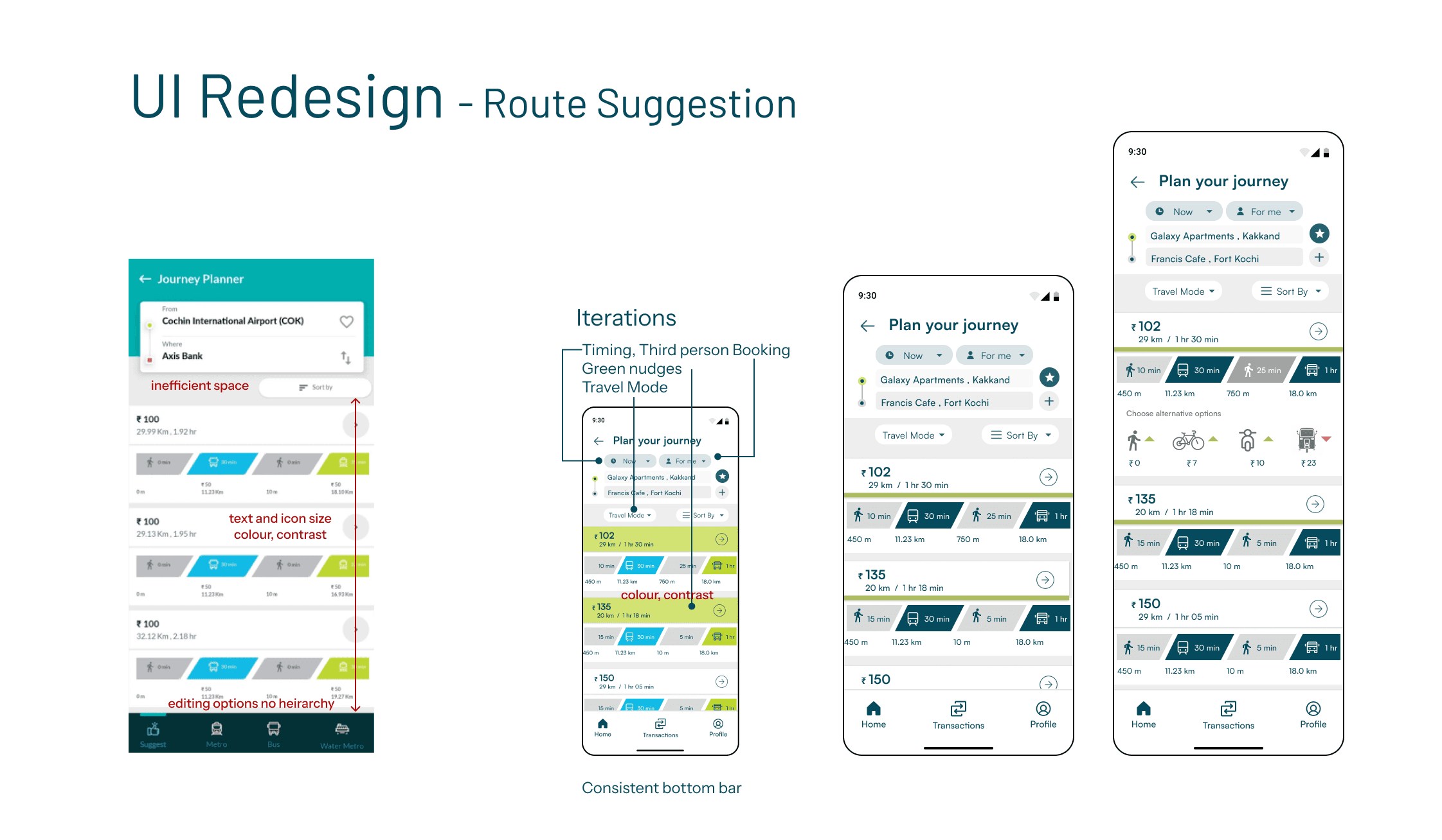
editable transfer buffers, alternative modes priced inline, and weather-aware routing, a shaded route when it is sunny and a place to wait out a downpour.
let the city be part of the trip
why
a first-time visitor and a daily commuter want different things from the same line.
tradeoff
surfacing places and stories without burying the core task of getting somewhere.
result
landmarks, cultural stops and quieter paths you can add to a route, so a journey can be built around what is worth seeing rather than only how fast it is.
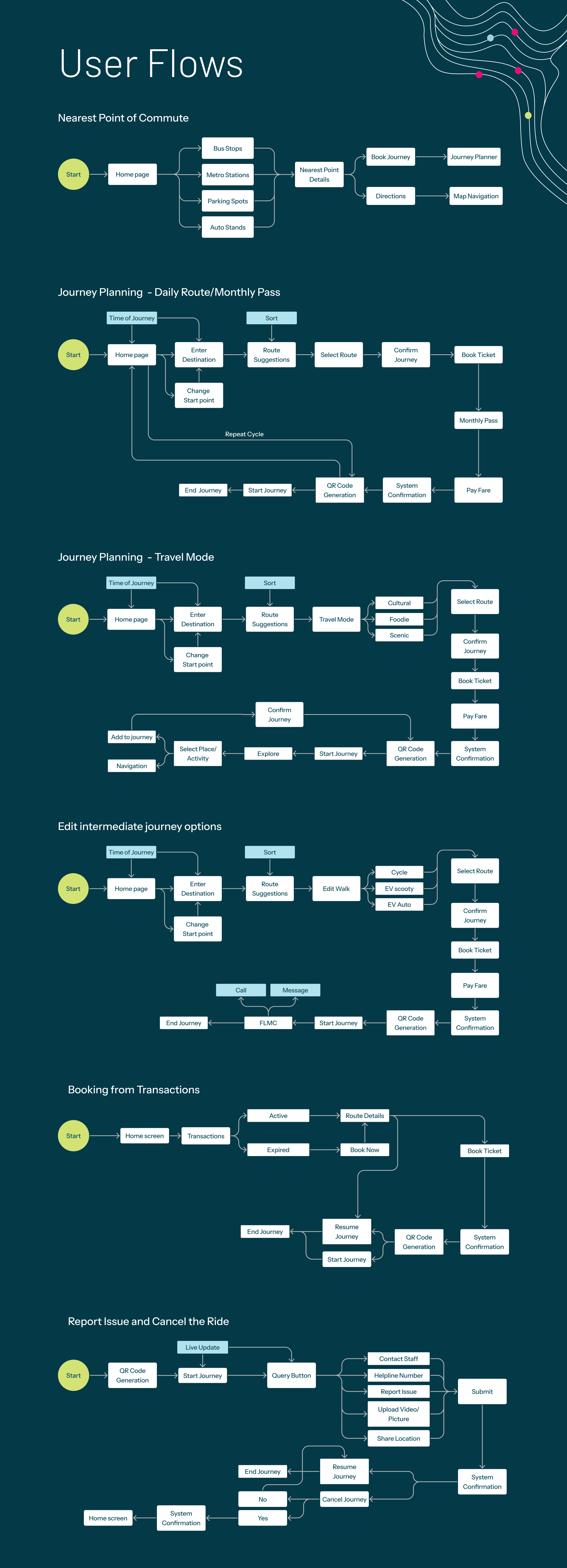
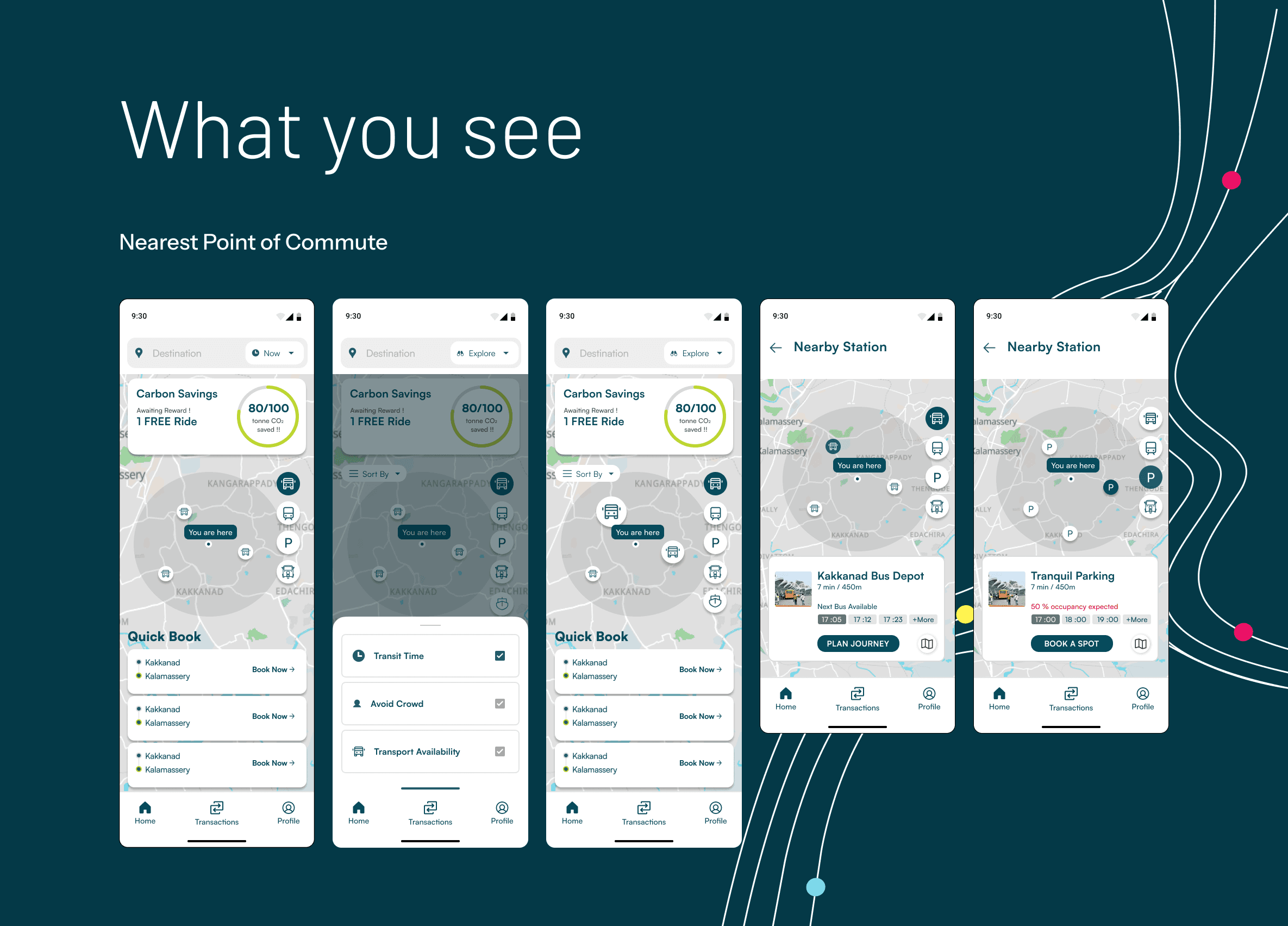
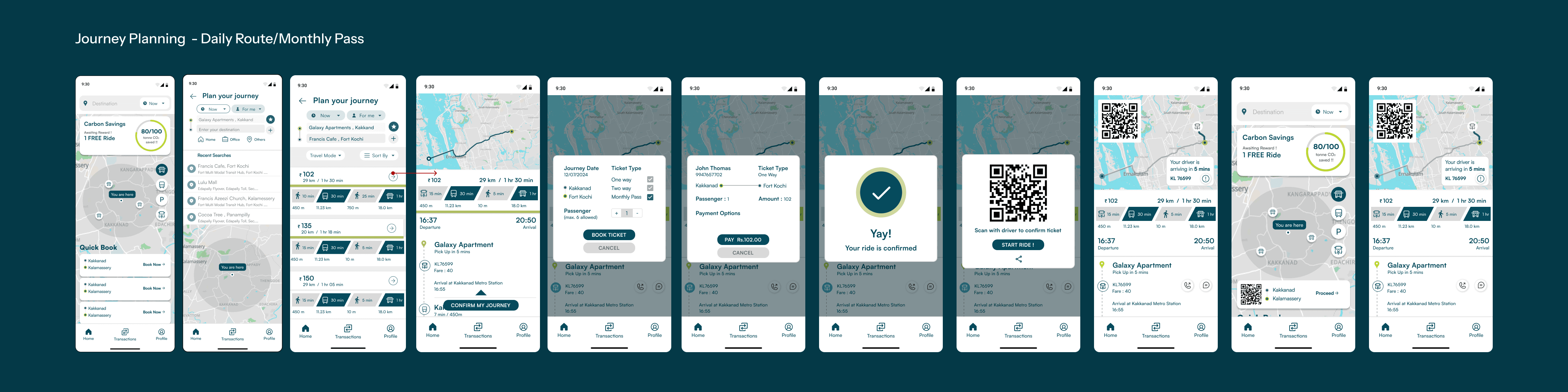
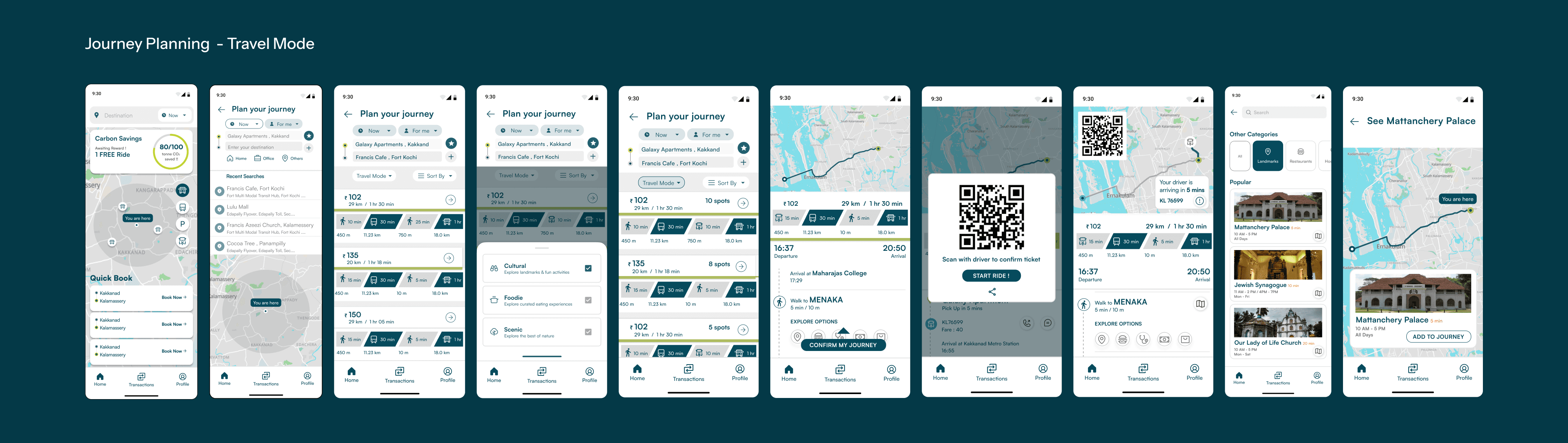
planning by intention
intention
cultural, scenic, food, half a day, home by dinner.
route
the trip is built around that rather than only the fastest line.
transfer
editable buffers, and weather-aware routing when the wait is in the sun.
last mile
walk, cycle or auto, priced inline, plus the landmarks worth stopping at.
scroll the run →
testing it
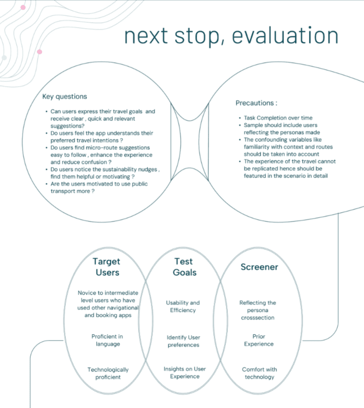
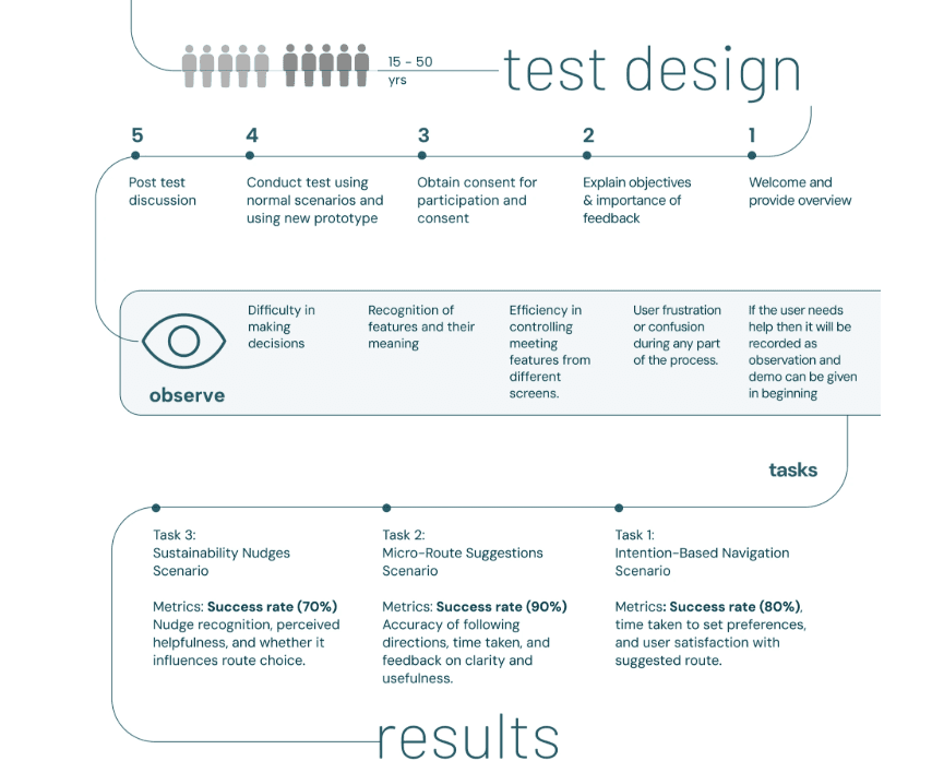
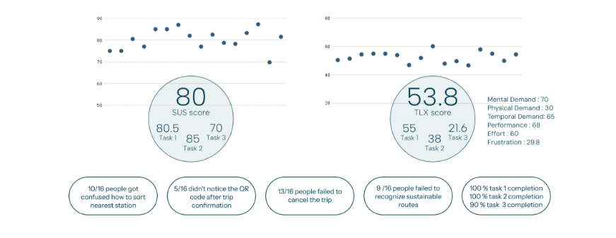
the redesign was tested with sixteen participants aged fifteen to fifty, against three task scenarios: intention-based navigation, micro-route suggestions, and the sustainability nudges.
the protocol was written before the prototype, and so was what to observe, so difficulty, recognition, efficiency and frustration were recorded rather than remembered.
the part of the thesis the testing did not support
first direction
the sustainability layer was the argument i cared most about: carbon saved against a monthly target, small real rewards for low-carbon routes, and the greener option surfaced inside the planner rather than parked in its own tab.
what happened
it tested worst of the three. the sustainability scenario scored 70 on sus against 80.5 and 85 for the other two, it was the only task that did not reach full completion, and nine of the sixteen participants failed to recognise which routes were the sustainable ones at all.
what changed
a nudge is a visual-hierarchy problem before it is a behavioural one. the work assumed that if the greener route was present and cheap to choose it would be chosen; most people never saw it was on offer. recognition has to be measured separately from completion, because a task can complete at ninety per cent while the thing it was meant to demonstrate goes unseen.
outcome
tested with sixteen participants across three task scenarios. the redesign scored 80 on the system usability scale, 80.5 for intention-based navigation, 85 for micro-route suggestions and 70 for the sustainability nudges. task completion was 100 per cent, 100 per cent and 90 per cent against targets of 80, 90 and 70 set before the test.
cognitive load came out at 53.8 on nasa-tlx, with mental demand at 70 and temporal demand at 65 the two highest components and frustration lowest at 29.8. the load is in reading and deciding rather than in operating the interface, which is the right place for it in a planner and the wrong place for it in a commuter's daily route.
the failures are the more useful half. thirteen of sixteen could not cancel a trip, ten of sixteen were confused by sorting for the nearest station, nine of sixteen did not recognise the sustainable routes, and five of sixteen missed the qr code after confirming a trip. three of those four are recognition failures rather than comprehension ones.
it was delivered to kochi metro as a service-design study, personas, journey maps, service blueprints and policy plus design recommendations, not just a set of screens.
want the full story?
the twenty-four boards above are the study as it was made. what is not here is the raw material behind them: the interview transcripts, the full service blueprints, the causal loop diagrams and the policy recommendations that went out alongside the design ones.
the full service-design report is public. i am happy to walk through the research and the rounds the screens went through privately.
reflection
i spent far more of this project in interviews and service blueprints than in a design file, and the screens only got obvious once i could see the whole service around them: the station staff, the auto drivers outside, the walk at the end nobody had mapped. the testing then did what testing is for, which is to disagree with you. the part i was most attached to is the part sixteen people could not find.